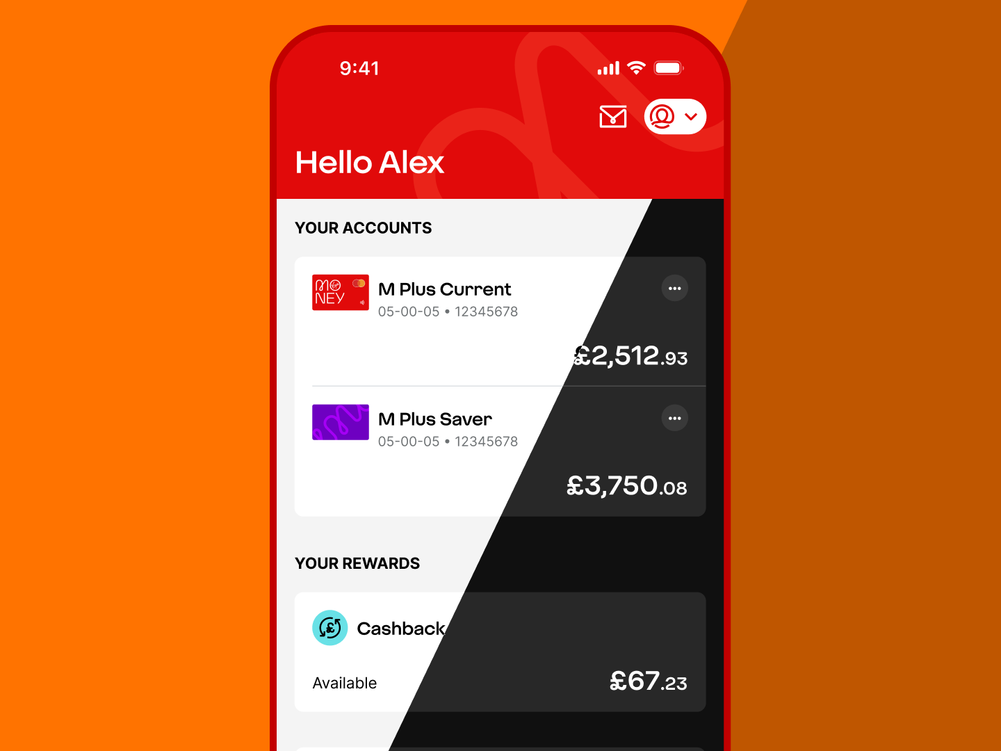
Lifting the curtain on dark mode
Our new single app framework is flicking the switch on stacks of bright ideas. Here we take a closer look at how it’s making banking easier on the eyes.
Dark mode is often seen as a visual enhancement, but in our apps it represents something bigger. It’s a chance to improve accessibility, strengthen brand expression and create a more consistent experience. It’s been made possible by our work to develop a new single app framework for our credit card, personal and business banking apps. And there’s more to it than meets the eye.
A more consistent foundation for the app
The watershed moment was moving our apps onto Flutter, the technology behind our apps’ user interface. It enables us to build and maintain features more efficiently across different devices while delivering a consistent, high-quality experience for customers.
And it allowed dark mode to be introduced as a more consistent and considered part of the overall experience.
This is more than a visual refresh. The work focuses on improving accessibility, strengthening brand expression and creating a more robust theming system that works effectively across both light and dark mode.
Improving accessibility through better contrast
A core aim of the update is to ensure the new dark mode experience meets WCAG 2.2 Level AA accessibility standards, alongside the existing light mode.
To support this, the colours used in dark mode have been refined to increase the contrast between backgrounds and surfaces. This makes the interface clearer, improves legibility and helps content feel easier to scan across the app.
Refining surfaces and theme structure
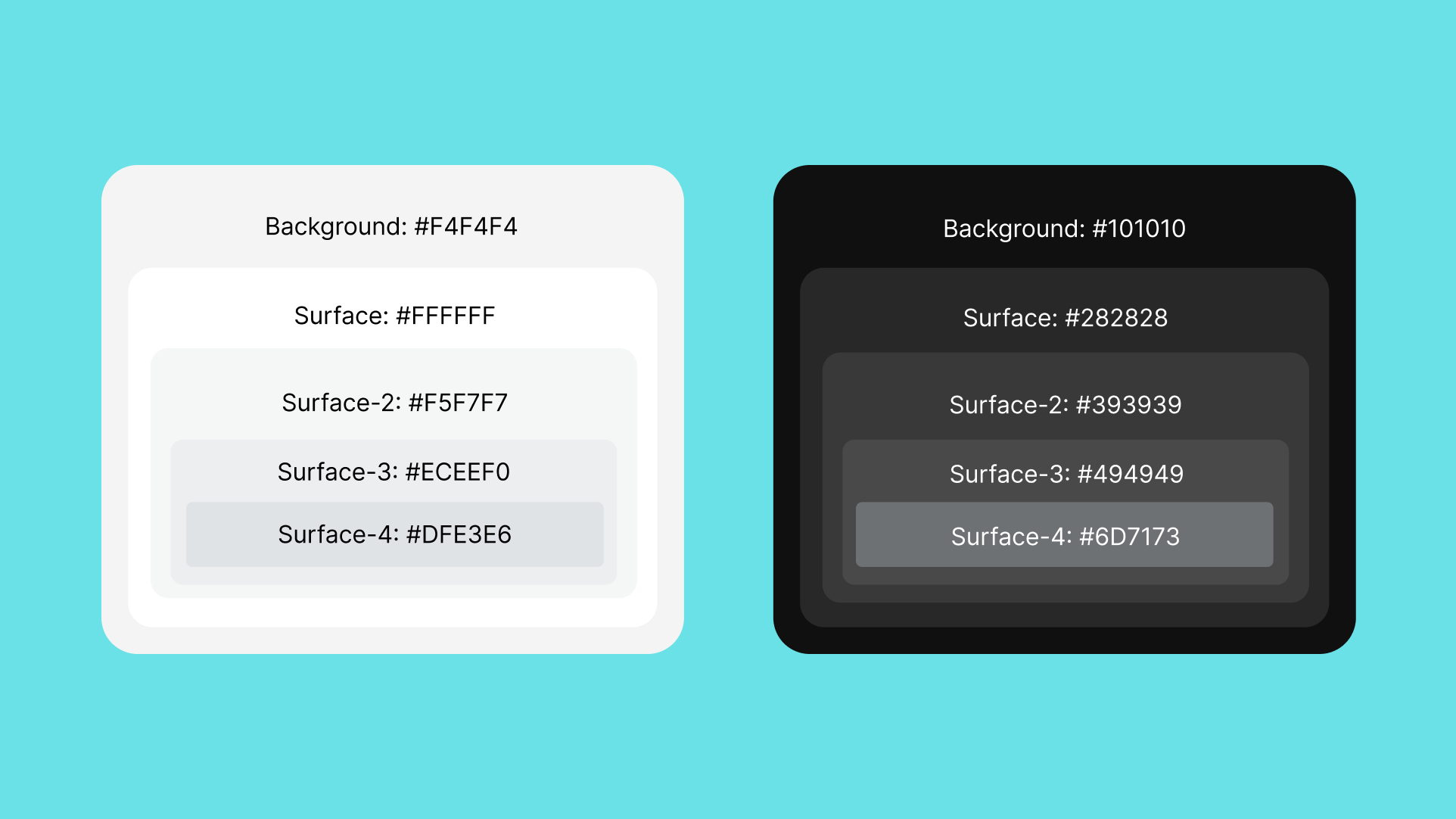
The updated theme introduces a more structured approach to backgrounds and surfaces in dark mode. Additional surface colours have been added to improve compatibility with native iOS and Android frameworks and to provide more flexibility for future needs.
Light mode colours have also been extended to mirror the dark mode theme, creating a 1:1 ratio of surface colours across both themes. This gives the system a more balanced structure and makes it easier to maintain over time.
Retaining solid colours to support the brand
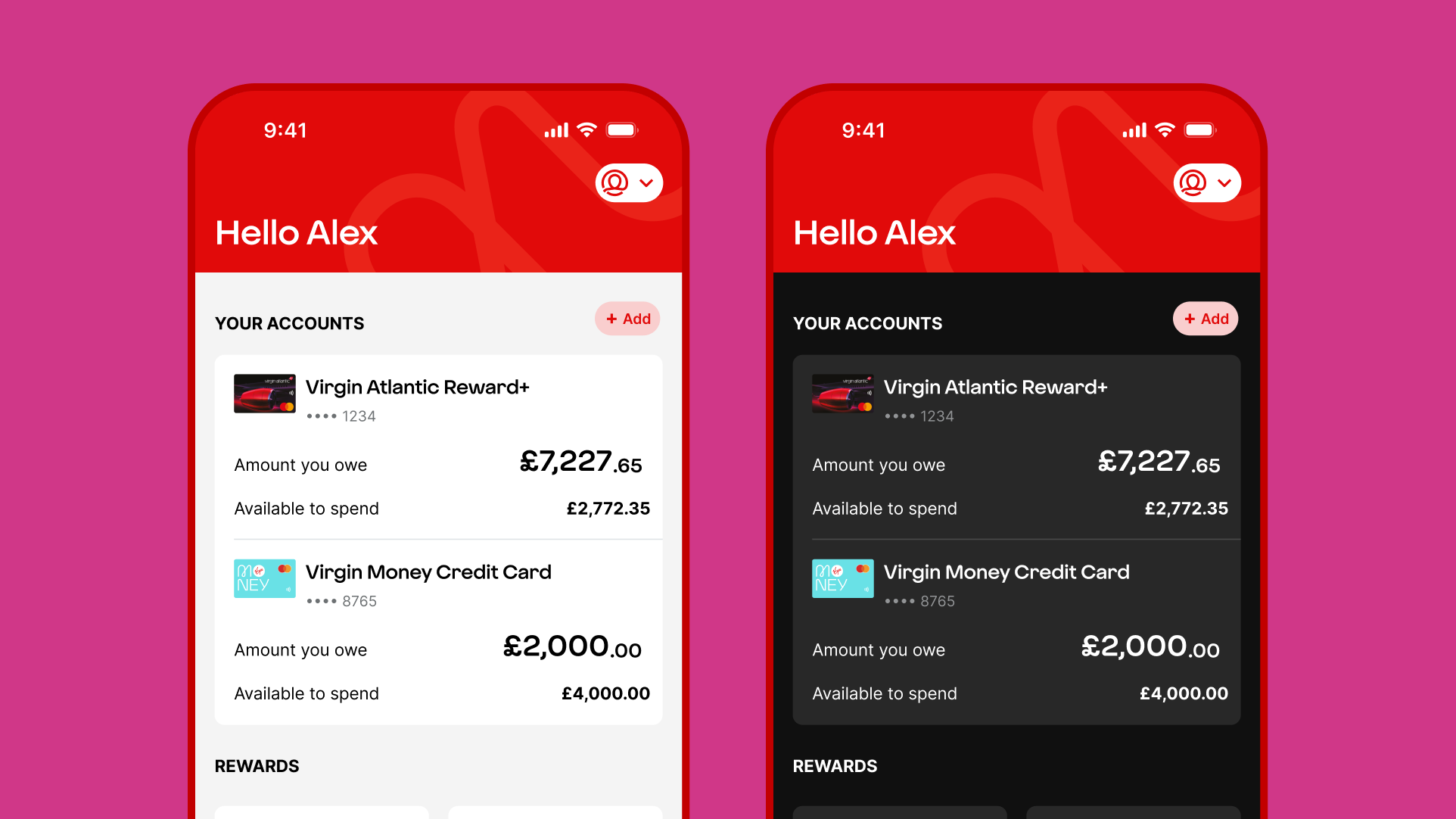
Another challenging part of this work is maintaining the definition of the Virgin Money brand in dark mode. Vibrant colours are a huge part of our brand identity. Rather than adjusting core brand colours to suit a darker interface, we’ve worked hard to retain those colours as they are.
We also moved away from semi-transparent colours in favour of solid colours. In dark mode, transparency can create diluted or inconsistent tones that weaken the intended palette.
Using solid colours gives greater control over contrast and helps icons and illustrations remain clear sharp and more consistent with the Virgin Money brand palette. It also helps retain AA colour contrast across the interface.
Creating a flexible approach across app themes
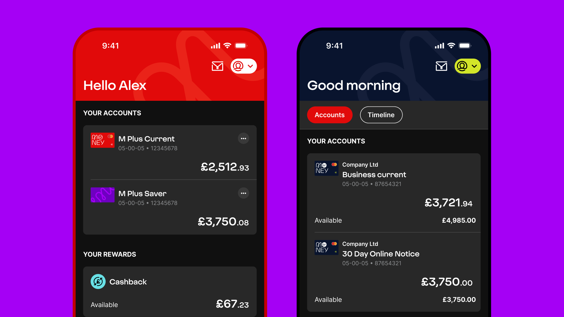
We designed dark mode to work across the different app themes while still respecting their individual character. The personal and credit card themes use a red header. The business theme uses a midnight blue header.
This means dark mode is not treated as a single visual overlay. Instead, it becomes part of a flexible design system that can support different product experiences within one shared framework.
Improving key customer journeys
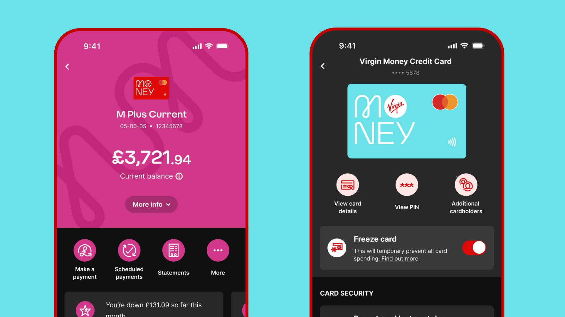
The new designs show how dark mode can improve the clarity and consistency of important screens in the app. On the home screen, it creates clearer separation between the background, primary surfaces and secondary surfaces. It also retains full-colour headers and imagery.
In the account view, full-colour headers and icons sit within a more stable and accessible dark palette. In payments, the design combines richer brand colour moments with clearer surfaces and bespoke icon colours.
In the manage card screen in our Cards app, dark mode preserves the visual impact of the card and iconography. It also improves readability through cleaner surfaces and deeper backgrounds.
Building for the future
These changes create a dark mode experience that feels intentional rather than adapted. They provide a stronger foundation for accessibility, consistency and future maintenance.
The additional surface layers also provide flexibility. This helps future-proof the design system, if more layers are needed for other display modes later.
What dark mode means for customers
For customers, this work delivers a mobile banking experience that feels clearer, more comfortable and more polished. For design and engineering teams, it creates a more reliable theming model that can scale consistently across the app.
Dark mode is therefore not just a new theme, but a sign of a more mature and deliberate design approach. As the Virgin Money Mobile Banking app continues its move onto Flutter, dark mode ensures a more accessible and inclusive experience for all.