Redesigning the Business Banking Sign‑in Experience
Delivering a seamless and intuitive sign‑in experience is critical in digital banking—especially during periods of change. As Virgin Money integrated customers from Clydesdale Bank and Yorkshire Bank, the need for a unified, user-friendly journey became increasingly important.
This case study explores how inconsistencies across platforms were identified and resolved through thoughtful UX design, testing, and iteration—resulting in a clearer, more efficient sign‑in experience for both Business and Personal Banking customers.
The Challenge: Fragmented Journeys and Growing Complexity
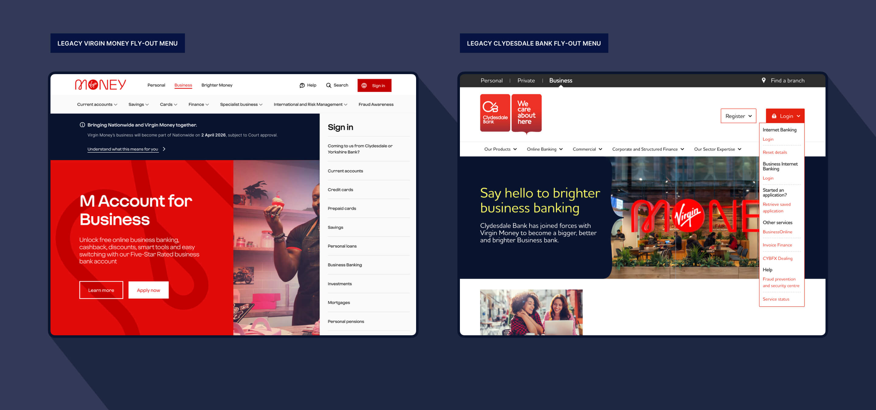
Between January and November 2025, Business Internet Banking recorded over 1.25 million logins across Virgin Money, Clydesdale Bank, and Yorkshire Bank. Despite this high volume, the sign‑in experience was far from consistent. Customers faced several key challenges:
- Poor discoverability: Business Banking sign‑in links were buried among Personal Banking options, making them difficult to find.
- Irrelevant pathways: Business Banking users were presented with Personal Banking registration links, leading to confusion.
- Duplicated experiences: Identical sign‑in options appeared across different areas of the site, creating uncertainty about the correct route.
- Terminology inconsistencies: Different brands used different naming conventions, making it harder for users to identify the right platform.
At a time when customers were transitioning between brands, these issues added unnecessary friction to an already sensitive journey.
The Approach: UX Review, Testing and Iteration
To address these challenges, the team conducted:
- A comprehensive UX audit
- Competitor analysis
- Targeted user testing
- A/B testing of design concepts
This approach allowed designers to uncover the root causes of confusion—particularly around navigation hierarchy and terminology.
Solving Terminology Confusion
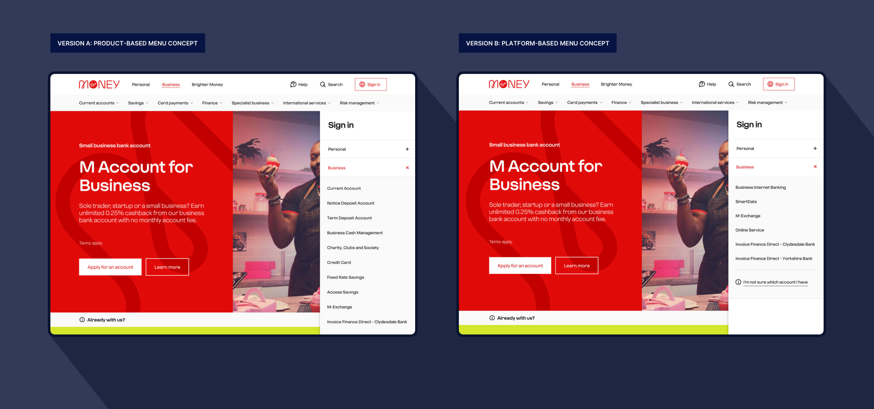
A major source of friction stemmed from inconsistent naming across brands, with Virgin Money using product-based labels while Clydesdale and Yorkshire Bank relied on platform-based terminology. This inconsistency created uncertainty for users about where they should sign in. To address this, two different naming strategies were tested to identify a clearer, more intuitive approach:
- Version A (product-based): Clear but overwhelming due to too many options (products)
- Version B (platform-based): Simpler, but introduced confusion between similar terms
Improving Navigation: Making Sign‑in Simple
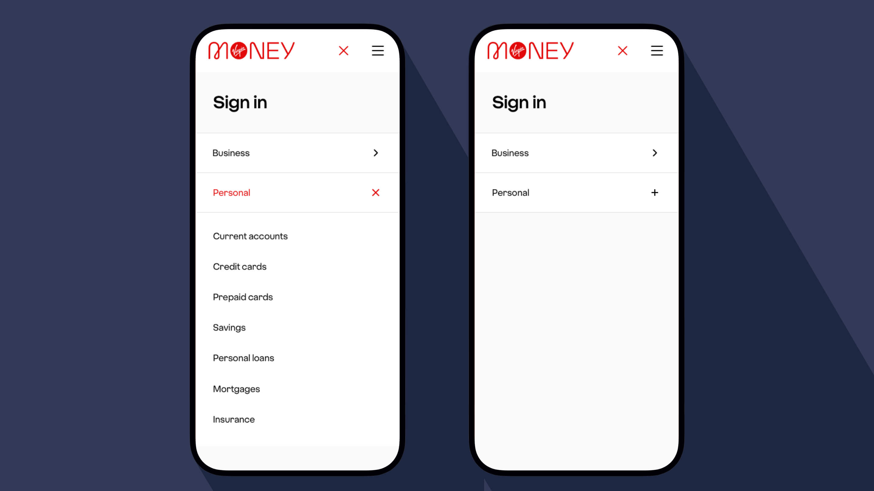
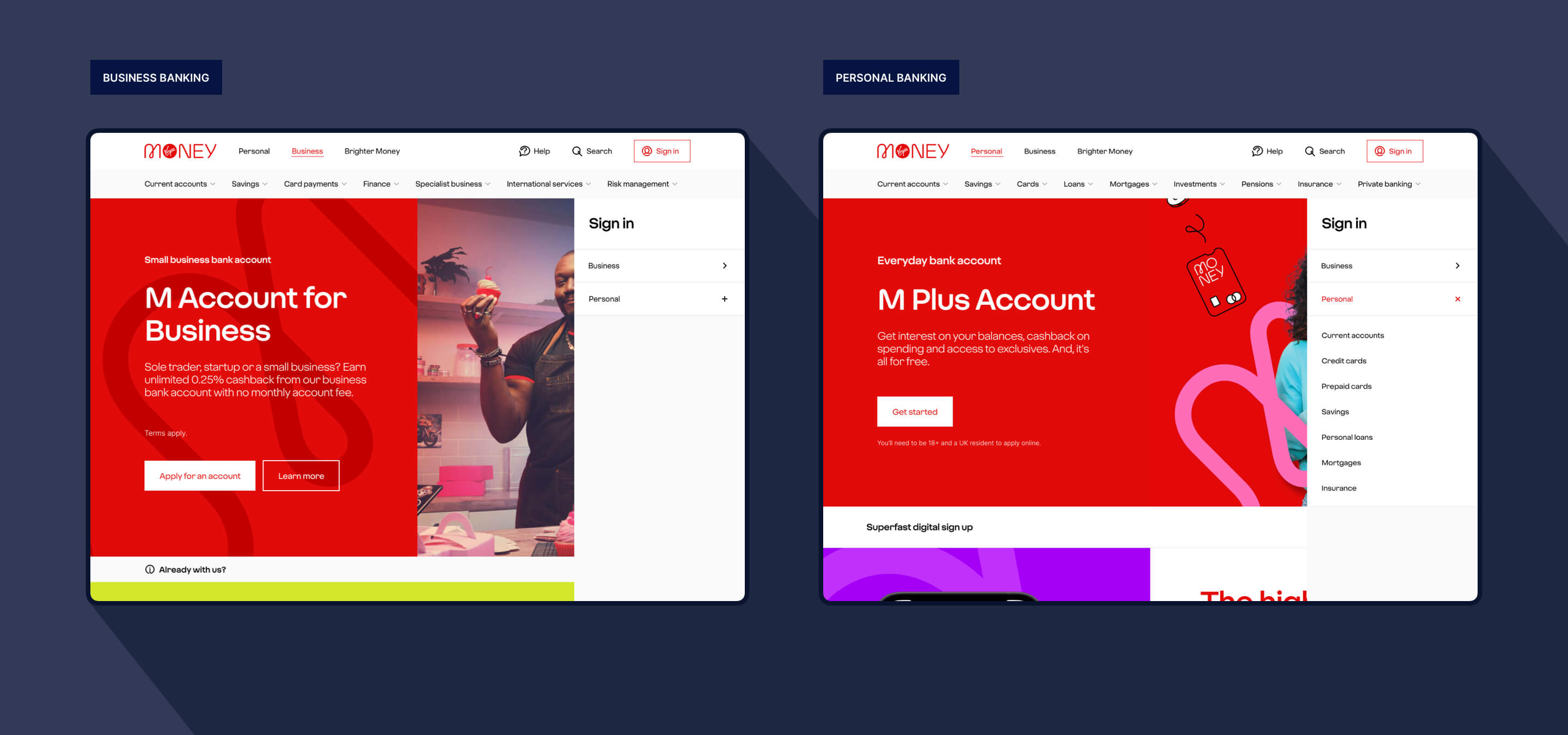
One of the most impactful changes focused on restructuring the global navigation to elevate the visibility of Business Banking. The Business Banking sign-in link was promoted to the same level as Personal Banking and positioned within a dedicated directory, rather than being hidden within sub-navigation. In addition, users were taken directly to the sign-in page, removing unnecessary steps from the journey. Together, these changes ensured that business customers could immediately see and access the correct pathway with ease.
Contextual Navigation for Different Users
The redesigned navigation adapts intelligently based on user context, ensuring a more relevant and focused experience for each audience. Business Banking customers are presented with a streamlined menu where Personal Banking options are minimised to reduce clutter and support more efficient task completion. At the same time, personal customers continue to experience the familiar navigation they expect, with no disruption to their journey. This balanced approach delivered meaningful improvements for Business Banking users while preserving the integrity of Personal Banking experiences.
Validating the Design: User Testing Results
As part of the Business Banking sign-in navigation redesign, we recognised the potential impact on Personal Banking customers. User testing was conducted with Personal Banking customers to understand whether the new design affected their experience and to identify any areas of confusion or friction. Extensive testing confirmed the effectiveness of the redesign.
Potential Personal Customers
UX Score: 4.28 / 5
- Confidence (4.44)
- Ease of use (4.34)
- Information clarity (4.20)
- Satisfaction (4.10)
Existing Personal Customers
UX Score: 4.46 / 5
- Confidence (4.43)
- Ease of use (4.57)
- Information clarity (4.43)
- Satisfaction (4.43)
Importantly, these results demonstrated that the new structure did not negatively impact Personal Banking users, while significantly improving the experience for Business customers.
Our design
Our design used a mix of platform-led names and product labels. Although not the most conventional approach, it proved the most effective for business customers based on their familiarity with the platforms.
The team adopted a hybrid approach centred around a familiar and widely recognised term, establishing “Business Internet Banking” as the primary entry point for most account types, including Current, Savings, Charity, Notice, and Deposit accounts. Product naming was retained selectively to differentiate specific journeys where necessary, ensuring that distinctions were still clear where it mattered most. This approach successfully balanced clarity with simplicity, enabling users to quickly and confidently identify the correct option.
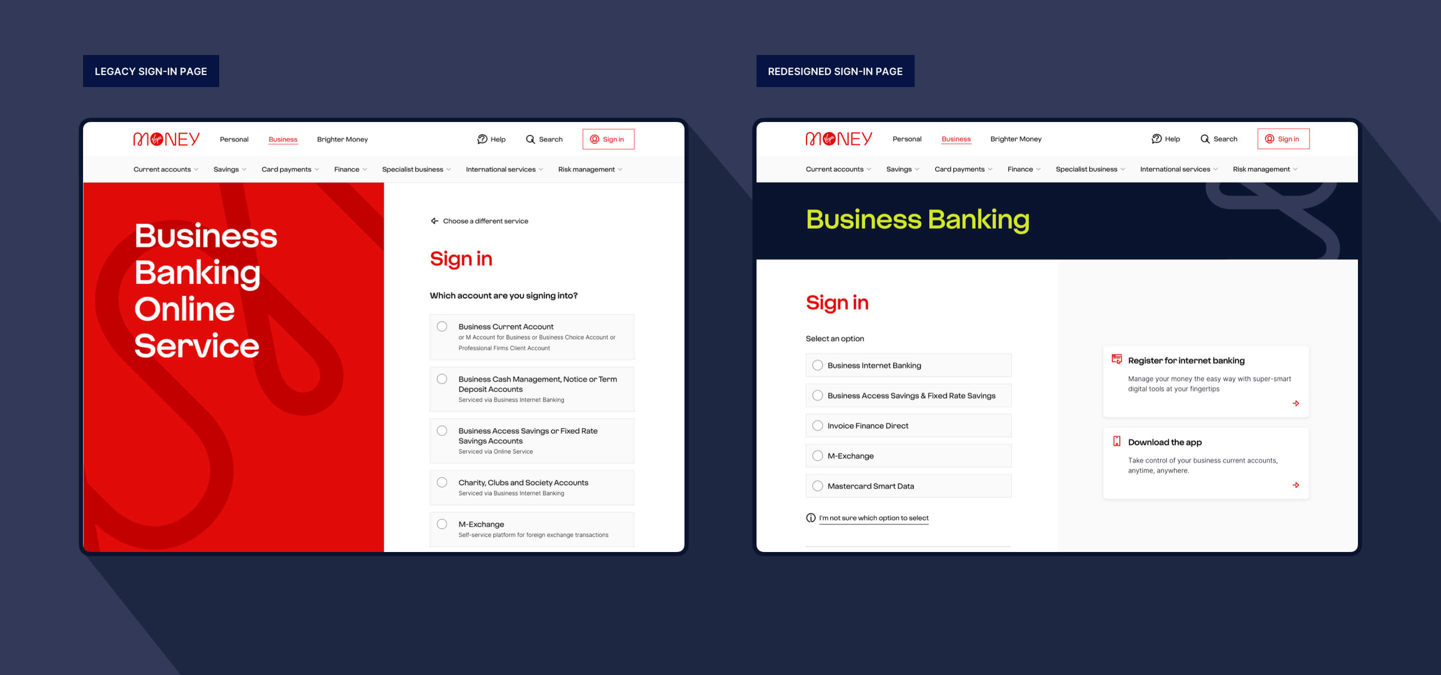
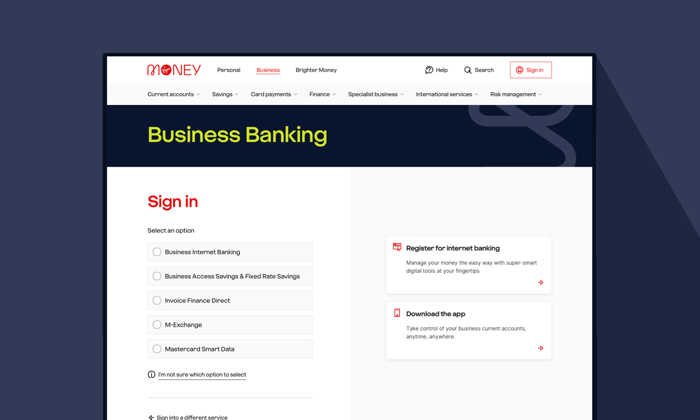
With the first iteration of the redesign of the sign-in experience, we were unable to deliver system error messages and communicate planned platform outages due to the limitations of the “select and go” fly-out menu. This approach, combined with the complexity of servicing multiple different platforms and the absence of a subsequent page where such critical information could be displayed, created a significant gap in user communication. As a result, it became inevitable that we would need to re-introduce an additional step in the user journey in the form of a dedicated sign-in page, ensuring that important system messages and outage notifications could be clearly and reliably presented to users.
Enhancing the Sign‑in Experience
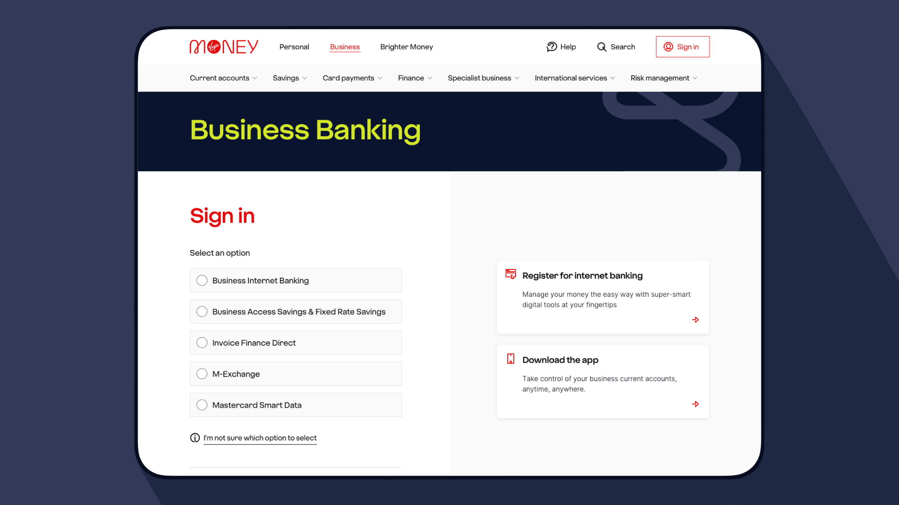
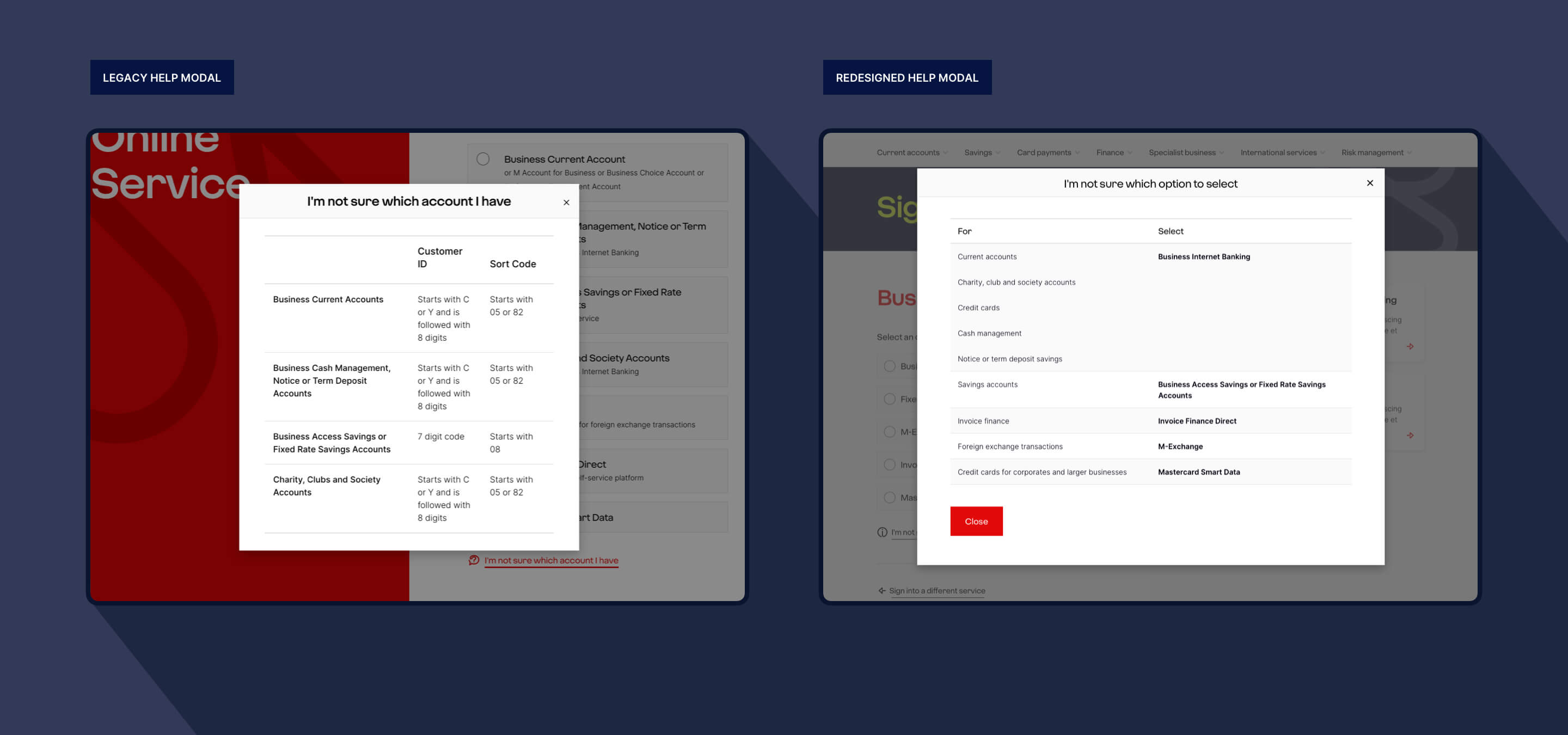
Beyond updates to navigation and terminology, several improvements were introduced to reduce friction in the sign-in experience. Access to key actions was significantly improved through the addition of direct links to registration and app downloads, while previously hidden pathways were surfaced to make them more visible and accessible.
At the same time, help content was simplified by removing complex details such as customer ID formats and sort codes, ensuring that guidance is easier to understand. The revised support content now focuses on task-based decision-making, enabling users to quickly identify the right platform based on what they want to do.
The Outcome: A Clearer, More Cohesive Experience
The final design delivers a more streamlined and effective user experience by reducing friction in the sign-in journey and improving the discoverability of Business Banking. It introduces consistent terminology across brands and incorporates context-aware navigation tailored to different user groups, resulting in higher levels of user confidence and satisfaction. By simplifying choices and aligning experiences across platforms, the redesign better supports both new and existing customers at a critical stage in their banking journey.
Key Takeaways
This project highlights several important UX principles:
- Clarity beats completeness: Too many options can overwhelm users
- Consistency reduces cognitive load: Aligning terminology across platforms is critical
- Context matters: Tailoring navigation based on user intent improves usability
- Test early, iterate often: User feedback is essential to validating design decisions