Adopting Dynamic Font Scaling in our apps
Senior Digital Designer, Nicky, talks us through how we approach Dynamic Font Scaling to improve our customer experience.
What is Dynamic Font Scaling?
Dynamic Font Scaling is an accessibility-based feature that allows users to choose the size of the text displayed on their screen. With over 2 million people in the UK living with sight loss, it’s a hugely important feature to improve our user experience.
Dynamic Font Scaling not only allows an increase in text size, but also a decrease. Both iOS and Android devices allow users to choose what’s right for them and a slidable scale can be accessed from the settings on each device.
Choosing the right scale
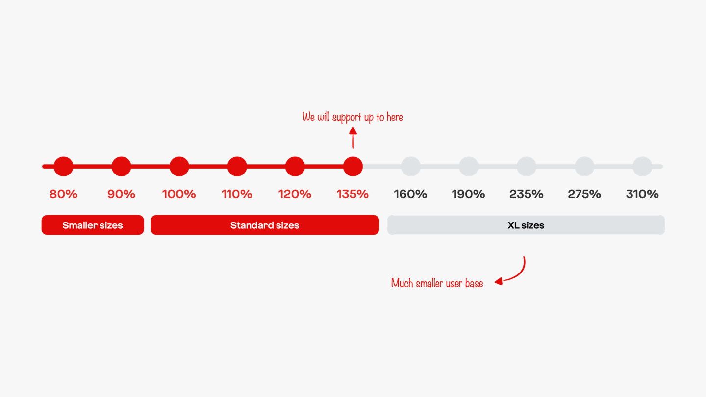
Our first step was to research how other apps accommodate Dynamic Font Scaling. After looking at a wide range of apps across different operating systems, we decided to take the iOS approach as our starting point and made sure that we catered for all the standard sizes from xSmall at 80% right up to xxxLarge at 135%. We then applied the same rules for Android devices.
Putting our scale to the test
Once we’d made a decision on font sizes, we experimented to see how our screens looked. We noticed issues with some of our more complex screens which needed addressing.
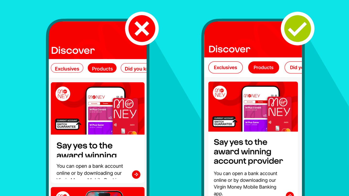
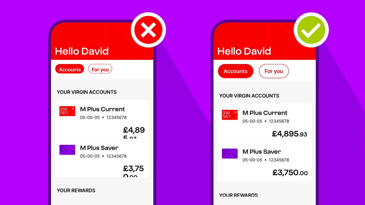
Some of our content was cut off and users were unable to scroll, it made our app unusable.
We also had to think about character limits and the truncation of our text. Should we allow our text to wrap onto multiple lines? In collaboration with our Content Design team, we agreed that truncated text would be unhelpful for users. We also agreed that we’d need to create rules around certain pieces of content.
The padding and spacing between elements was also considered to ensure that content was readable and elements weren’t crashing into each other.
By considering all of these points, we were able to ensure that all our screens stayed usable and accessible for all our customers, regardless of font size.
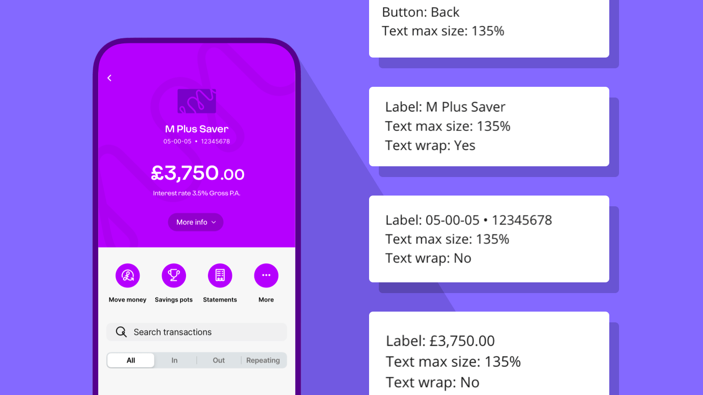
Them’s the rules!
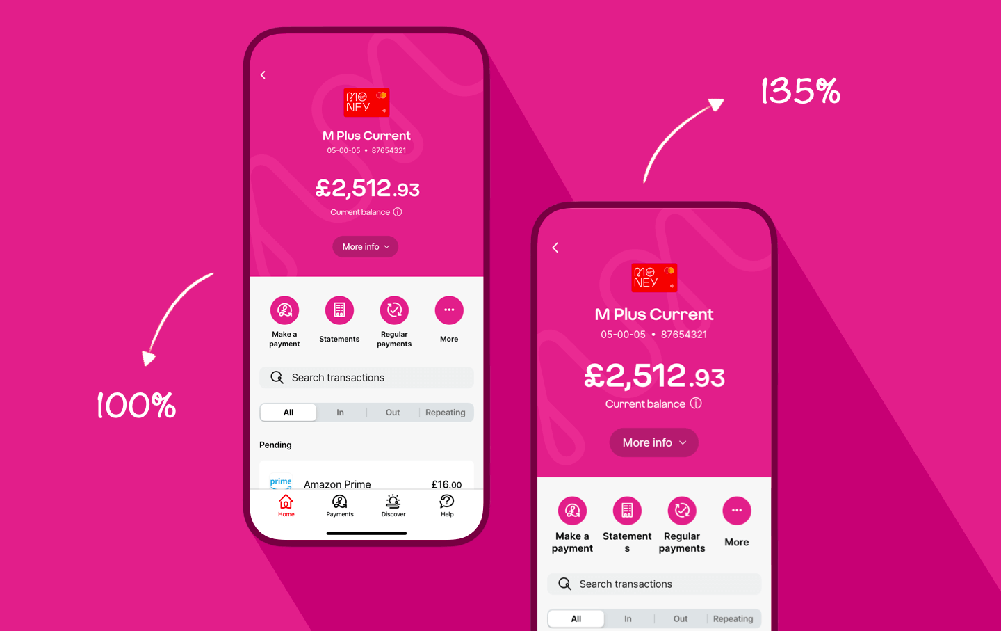
As our text scales up to 135%, it might not always lead to a user-friendly layout for our customers, so we defined exception rules for sensitive information such as balance and transaction amounts.
When customers see these, we always prevent the text from wrapping and instead, only scale the font size until it matches the width of the device or its container within the screen. This means that balances and transaction amounts stay to a single line and continue to be readable.
Supporting our engineers
Annotated designs are provided so that the development and testing teams have a clear direction of what is allowed to resize and what is allowed to wrap onto multiple lines. This helps to keep everyone on the same page when we build our screens.
Looking forward…
Our next step will be to investigate accommodating the larger dynamic font sizes often know as ‘AX font sizes’ which range from 160% to 310% of the base text size.
We know that these sizes will currently break most of our app screens, so we’ll need to carefully rework our layouts to ensure that our screens are still usable. Watch this space!