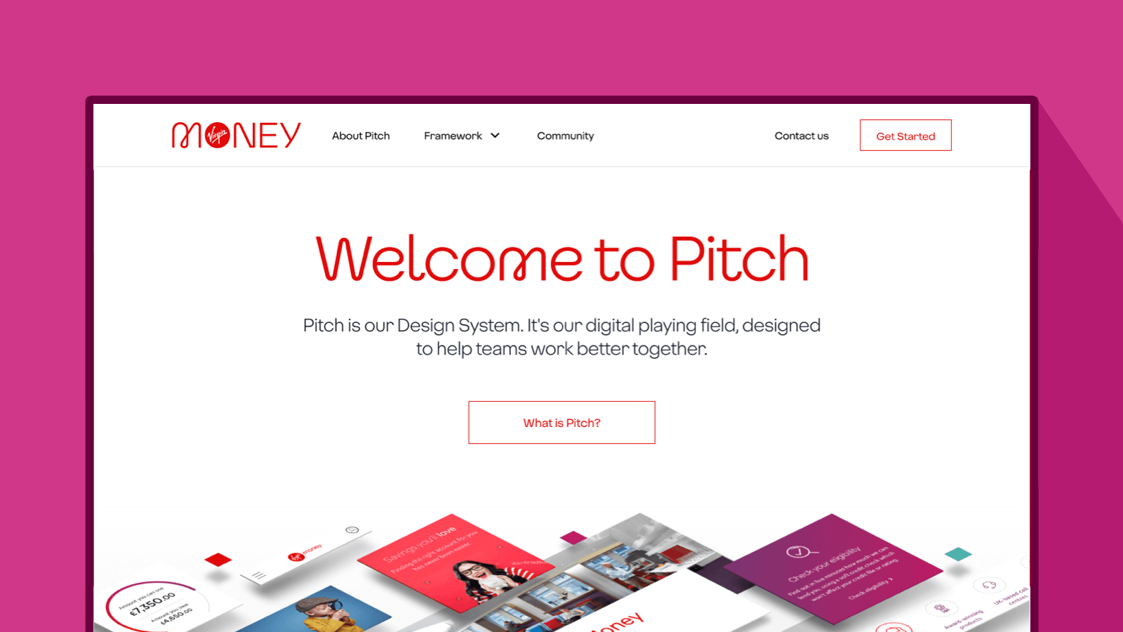
Creating consistency with Pitch
Our design system of the future
As a Design Team, we strive for consistency across our digital landscape. We believe everyone should have the same Virgin Money experience across all our digital touchpoints. One of the key tools we use to achieve this is Pitch, our in-house Design System.
Here we share how we developed the Pitch Design System and microsite from scratch. Discover how Pitch is our blueprint for excellence, helping us build experiences that are unmistakably Virgin Money.
What is a Design System?
A Design System is a set of standards that a business can use to manage design at scale. It includes the visual styles and code for how components work across mobile, tablet, and desktop.
It’s a set of reusable building blocks, components, patterns and guidelines. These give designers and development squads a clear baseline to work from. A good Design System ensures that digital experiences are consistent, whether it’s a web page, app screen or application form. It’s a lot like Lego pieces with specific instructions on how they fit together.
Consistency is king
We arm our Designers with UI Kits and page templates, both in Sketch, our go-to design platform. This means they have a solid foundation to build any user journey. Our Content Editors have the same components in the content management system. This means they can build web pages to the designer’s exact specifications. There’s no ambiguity or winging it here!
Our Design System working group has put together lots of guidance on Pitch. It’s super clear how, where and when to use each component. We also run informal feedback sessions to give designers input on inflight work. The result is a consistent output from each squad right across the business. What’s more, customers get the same great UI experience across the Virgin Money website.
Design once, use everywhere
When we built Pitch in 2018, we started with a set of UI designs for the Savings pages of our website. This was the first part of the site to use our smart new Virgin Money branding. It was also a manageable size for us to test and learn from.
We broke the entire UI down into individual elements. Together with a site audit, these were used to rebuild the whole website – no mean feat! This approach ensured the webpages didn't resemble Frankenstein’s monster when we put them together again! Working with live content also gave us confidence that our components worked.
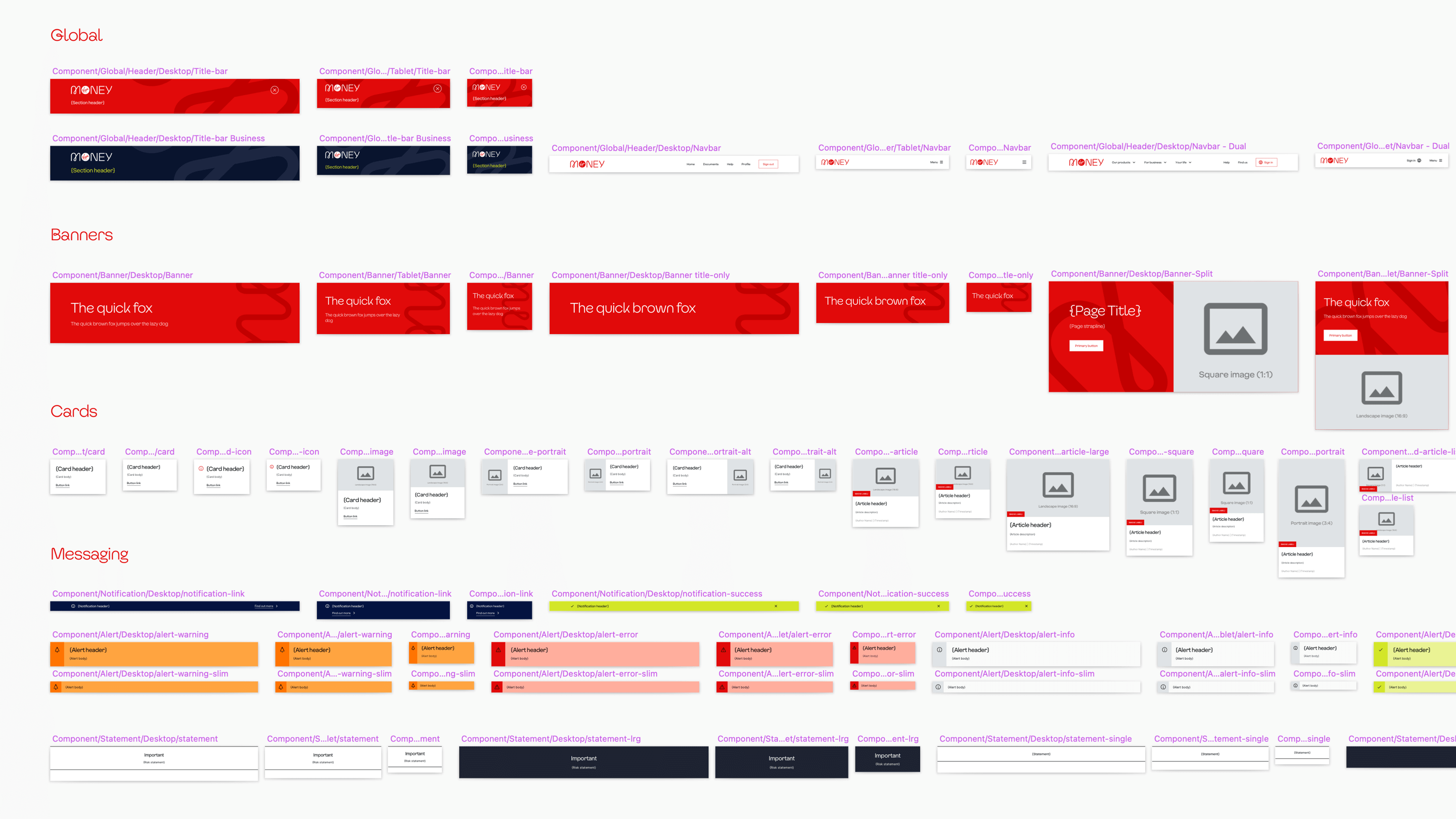
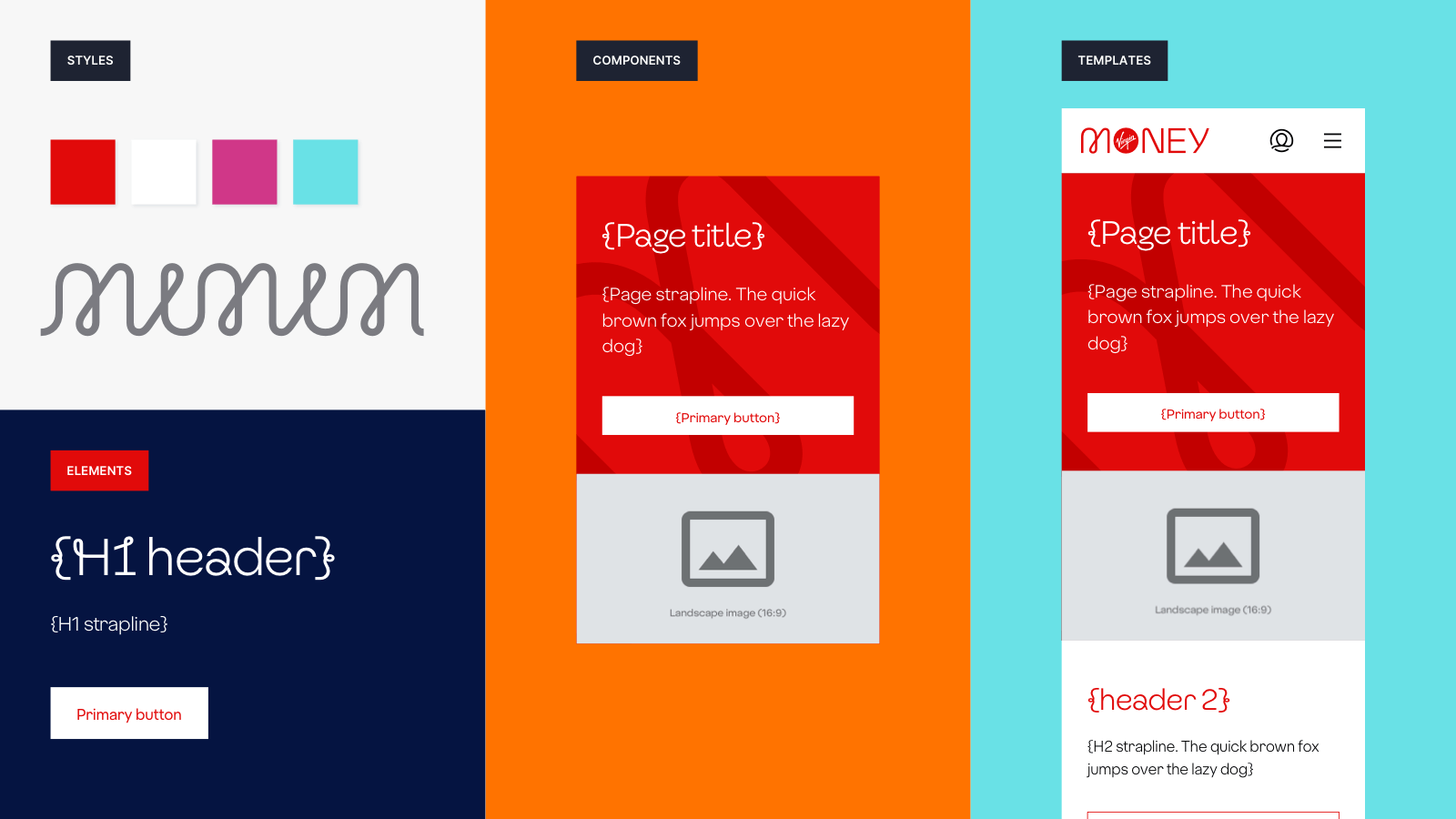
Using the atomic design methodology, here’s how we organised things:
Styles
Brand assets and variables that make the product or service distinctly Virgin Money.
Elements
The core HTML building blocks that all our interfaces are built from.
Components
Reusable parts of the user interface that can be used to create a variety of applications.
Patterns
Best practice design solutions for specific tasks, scenarios, and page types. This might be a section of a webpage, app screen or application form.
Templates
Page templates to ensure consistency across the whole experience.
Everything was set out in a style guide – this is a live (and very well used!) document on our Pitch microsite. Without getting too techy, it covers the CSS variables, user needs and ‘how to use’ guidance. Our developers used the guide to build our web framework. It’s the basis of our internal Pitch microsite too.
Once the framework was ready, the Design team used the same approach across the rest of the website.
They sorted out three things:
- Where we could use a page template
- Where components could be re-used
- Where we needed to design a new component
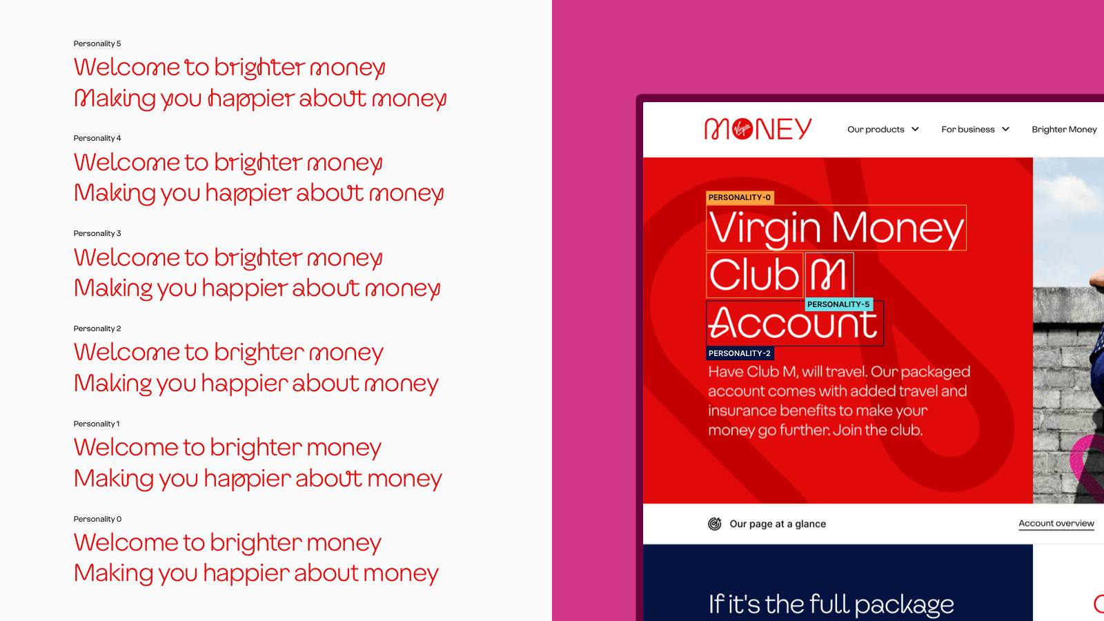
Untangling the new typeface
As part of our 2019 rebrand, we developed a new Virgin Money loop font. It’s instantly recognisable and based on the 'M' in the Virgin Money logo. We use the looped letters to create different personalities of our font. These are dialled up or down as needed.
Sometimes we want the loop font to be bold and really stand out, to grab attention on important parts of the website or in emails. We also need variations where the loops are less prominent. This might be where the focus is on sharing information with customers about their account.
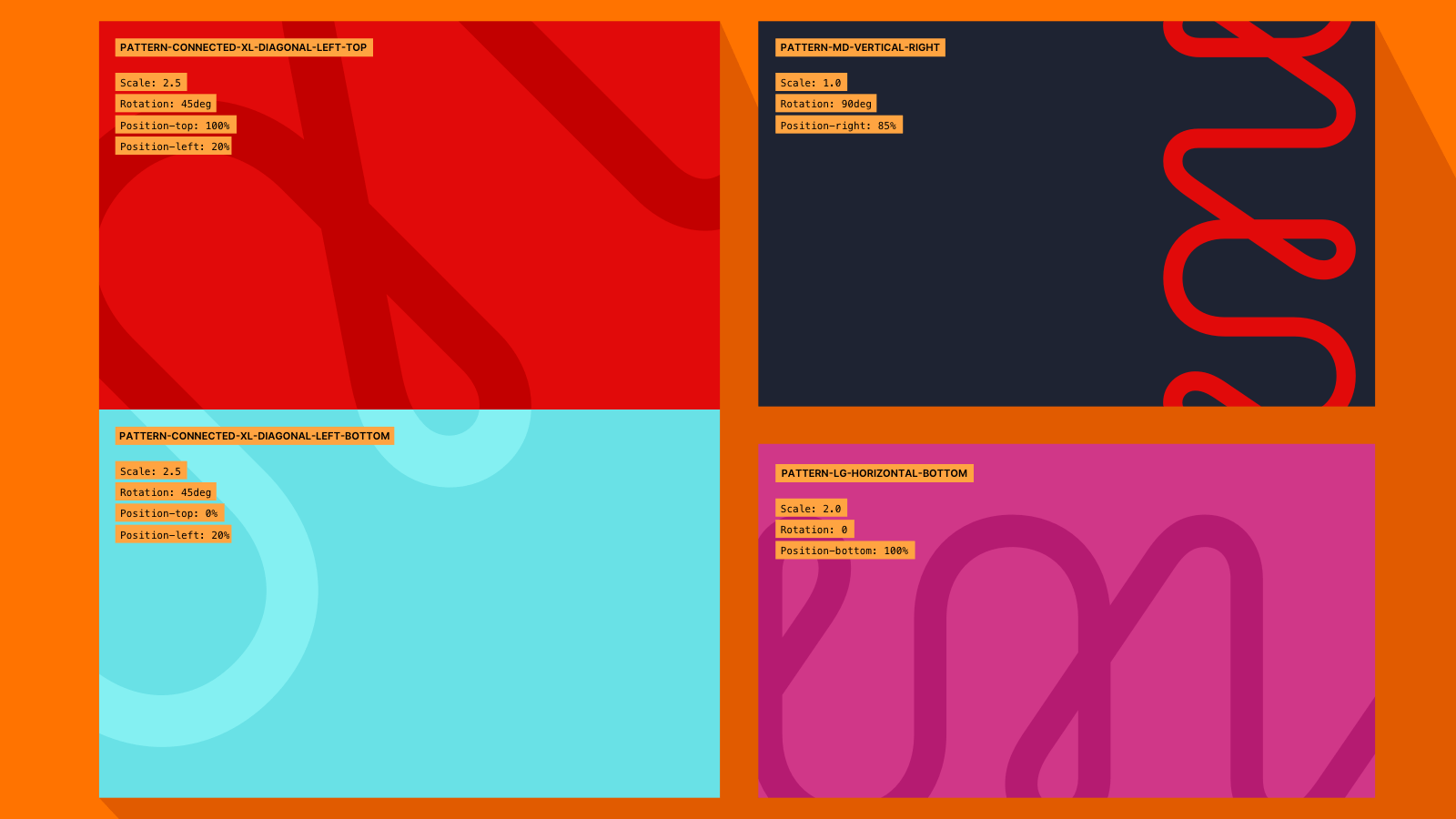
Meet our lovely loop pattern
Another brand asset from the rebrand is our loop pattern. It adds movement and energy, and gives a sense of connection too.
To bring the loop to life, we created a pattern system with a range of tint colours. Using light and dark backgrounds, the loop can be used with text without affecting readability.
We created options which scaled, rotated and positioned the loop pattern in different ways. We even used a ‘connect’ option with top and bottom positions. This gives our pages a fluid feel and encourages users to scroll down the page.
What’s next for Pitch?
We’re currently writing up some killer content guidance for each Pitch component. This is part of a wider set of content design principles developed by our Content Design team.
We’re always looking for ways to improve the Pitch framework. We’ll refine the styles and components backed with findings from user research and accessibility audits. That way, our website will be accessible by default.
Finally, we’re working with our developers to develop a similar framework for our mobile apps using Flutter, an open-source framework.