Evolving our Credit Card App
Good design never dies.
It just stays on the shelf until it finds the right time to be introduced.
We launched our Credit Card app in 2019. Customers quickly adopted it, and we have worked on continuously improving it ever since. Sometimes though, with lots of competing priorities, it’s not easy to find the right time to launch improvements.
One such improvement took nearly four years to make it from dreamed to delivered. Here’s the story of how our refreshed account summary screen came to be.
It all started so well
The challenge was set. Deliver a brand new app to market in under 9 months. That meant that we had to keep our scope and design iteration time exceptionally tight.
Despite the constraints, we successfully launched a solid app. We’d achieved our target. At this point, our customers still had a web portal for servicing their account, and we also sent them paper statements. The app was simply a more convenient way to manage a credit card with us. That convenience was appealing though, and customers flocked to download and use the app.
With our growing user base, we started analysing performance data. We also gathered feedback from customers, positive and constructive. We knew there was room for improvement; the app did basic tasks well, but customers were experiencing lots of pain points.
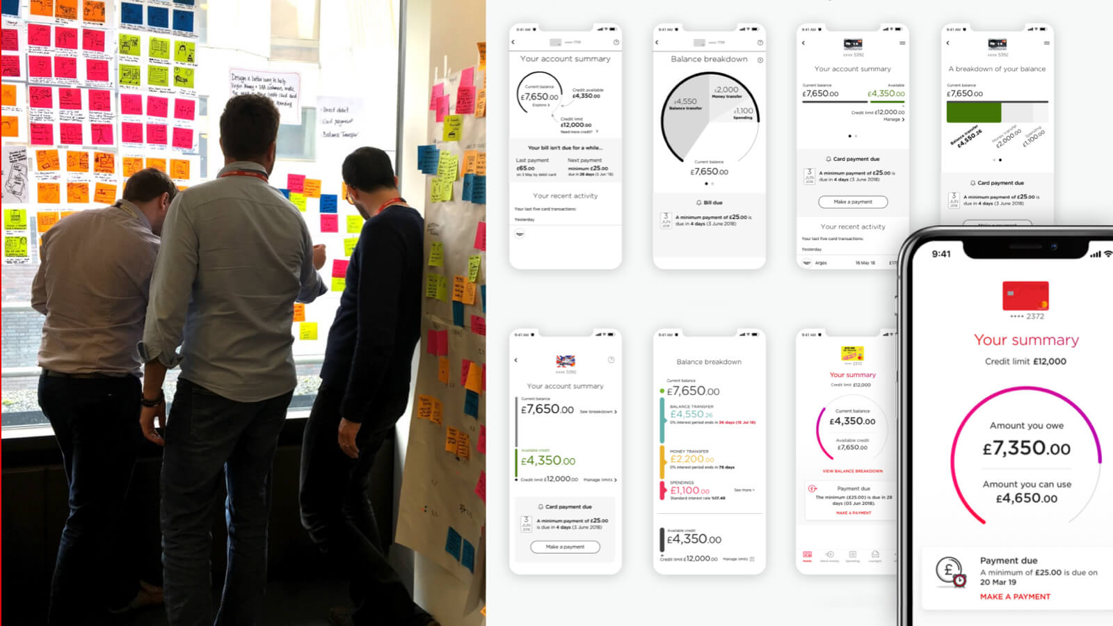
To understand what these pain points were, we ran Design Thinking workshops with IBM, our delivery partners. We invited colleagues from a wide variety of job roles, each with their own areas of expertise and insights.
Together, we built a shared understanding of our customers, the problems they were facing, and ideated on how we could solve these. Here were those key problems:
- How much do I need to repay each month, and by when?
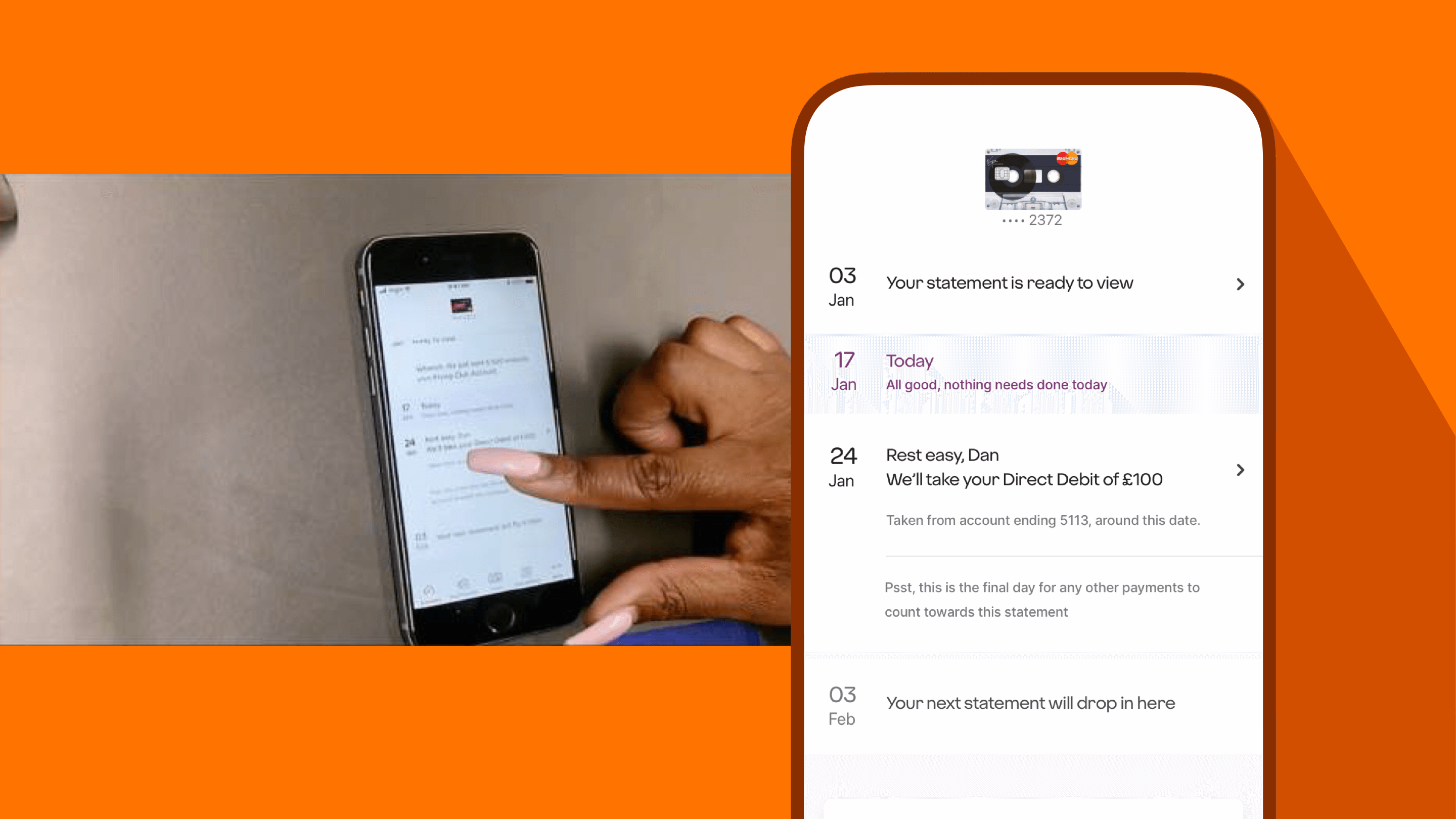
- When will my Direct Debit be taken?
- When is my statement ready?
- How much can I spend or borrow?
The problem with spending
Understanding how much to spend, seemed an obvious pain point . Our customers wanted confidence they weren’t going to miss a payment, as that might result in them losing their promotional rate. That’s often where they pay 0% interest for a fixed period of time.
Customers also wanted clarity about what they could spend or borrow.
We knew that visualising the relationship between three important pieces of information was the vital: Value A is how much the customer owes. Value B is how much the customer has left to spend or borrow, which is determined by Value C, their credit limit.
We discovered some customers were struggling with the account summary, which is the first view they see on opening the app. It tells a customer how much money they owe, and how much money they have left to spend. Originally it was presented in a colourful dial. They felt that this was counter intuitive.
Usually, full dials indicate something positive, like achieving a savings goal. But in an app where the user owes money, the way we were using it didn’t feel right; a full, colourful dial indicated a credit card customer was at their maximum credit limit.
It was a point of confusion, and the balance numbers we were displaying were close together, making them harder to understand at a glance.

Captain Obvious calls
Many of our credit card customers want to transfer a balance. They borrow money on their credit card, and they make monthly repayments. They want to know, with certainty, that their monthly repayment is going to be taken on time. But customers weren’t certain about this, and our contact centres were feeling their pain.
To coin a phrase from design guru Luke Wroblewski “Obvious always wins.”
It was clear that the original messaging in the app wasn’t obvious enough. So we increased the visual prominence and clarity of any payment message on the account summary screen. We also worked on the words, clearing up the message and the call to action.
As a result, the calls our contact centres received about payment dates reduced.

Test, iterate, test, iterate...
After the Design Thinking workshops we had a good concept, but we needed to test it with customers. We worked with Nomensa, a design and research agency, to test successive design variants. We ran qualitative, moderated test sessions with both Virgin Money and non-Virgin Money customers. With each test we uncovered a little more insight, which we fed back into our designs.
And, with each design evolution we saw task completion and overall satisfaction noticeably improve. By the end of the final sessions, we had full confidence in our proposed design.
What took you so long?!
A good question. 2020 and beyond provided its own set of unique challenges. Increasingly our customers used the app, so we prioritised delivering new functionality and increasing the app’s speed and stability.
Our customers preferred using the app, but to move away from the older web portal, we needed to ensure feature parity. This meant that all the tasks a user could perform in the web portal could be completed in the app. Together with the product team, we focused our efforts on that. And, we added in some key customer asks like Apple Pay and Google Pay.
But that well researched, thoroughly tested design was patiently sitting on the shelf. When an opportunity to implement it came up, we were able to dust it down and launch it.
Its impact has been substantial. Even small tweaks, like improving the visibility of the balance breakdown link, has seen a ten-fold increase in daily views.
Our Credit Card app now serves over 2 million customers.
If you want to find out the latest improvements, head over to our Credit Card App page. Or, you might be interested to read about Redi, our brand new digital host.