Forms follow function:
The art of form design
No-one wants to fill in a form. They’re a time investment. But when a customer has a great form experience it elevates a brand and reinforces its values.
A bad form will frustrate customers and reflect badly on a brand. Even worse, it can lead to unnecessary calls, messages and sometimes complaints.
At Virgin Money, we believe form design is an art. Great experiences embrace our core principles of ease, empowerment, and joy. They should be easy to use, empower our customers to complete an action, and feel a uniquely joyful ‘Virgin’ experience.
That’s why we’ve created our 10 commandments of great form design. Our Human-Centred Design team embrace them every time we work with forms, and we expect our partners to embrace them too.
1. The red front door
Our red-hot red is unmistakably Virgin. We use a large wash of it to welcome our customers at the beginning of a journey.
On screens with form inputs, we dial down the brand and focus on ease-of-use. We reserve the colour red for error messages, and to act as an accent colour on actions such as primary buttons. This enables us to craft a form which is user-friendly, effective, and feels distinctly Virgin.
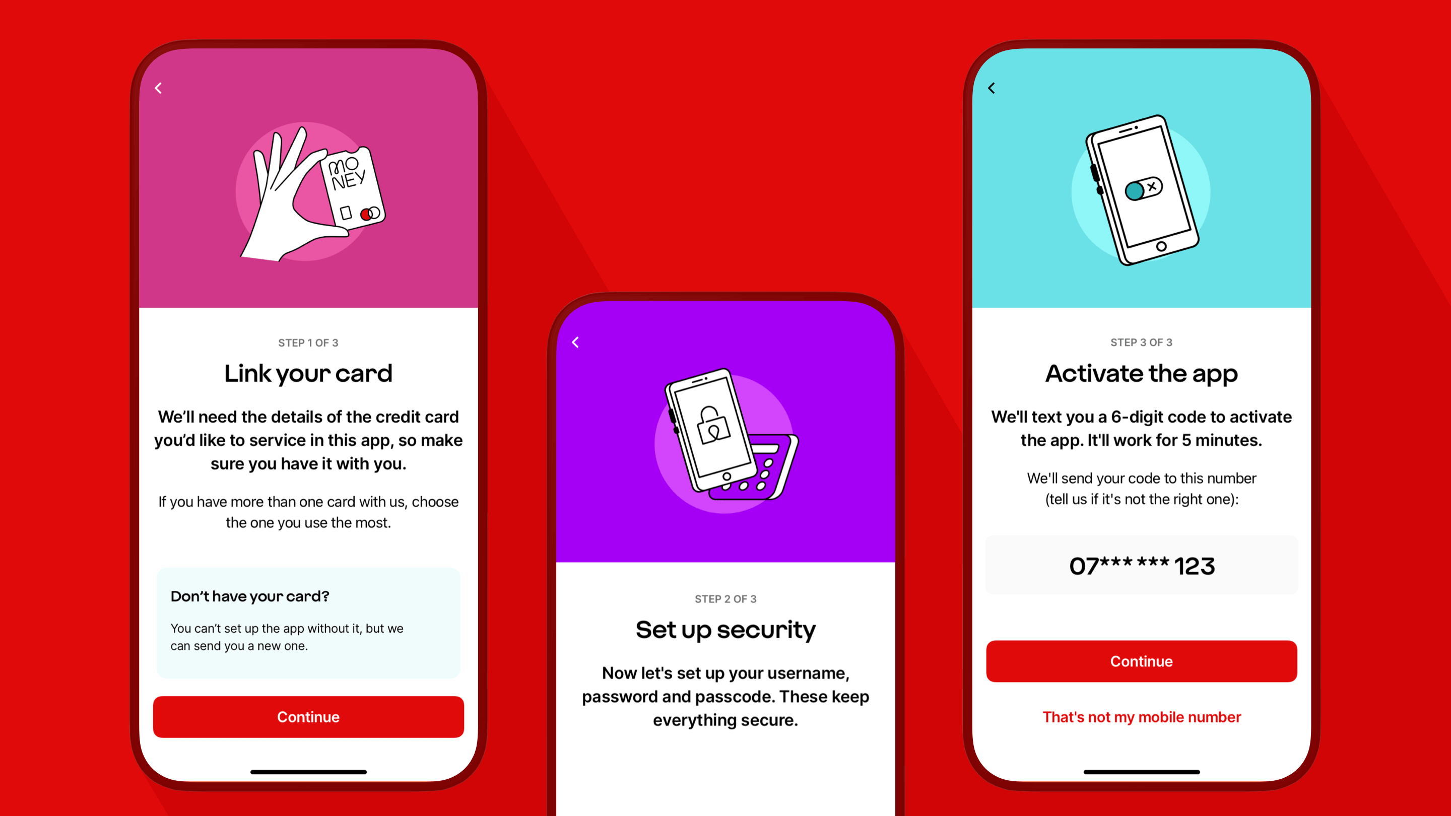
2. Chunk up the journey
Forms can be taxing, so we break longer journeys up into the sections with interstitial screens.
This helps maintain attention and makes the form feel easier to complete. Our interstitial screens frame what the next task is and what is required. They are a point to pause, or to mark a successfully completed activity.
They are also a good moment to inject a touch of brand personality; we can dial the Virgin up.
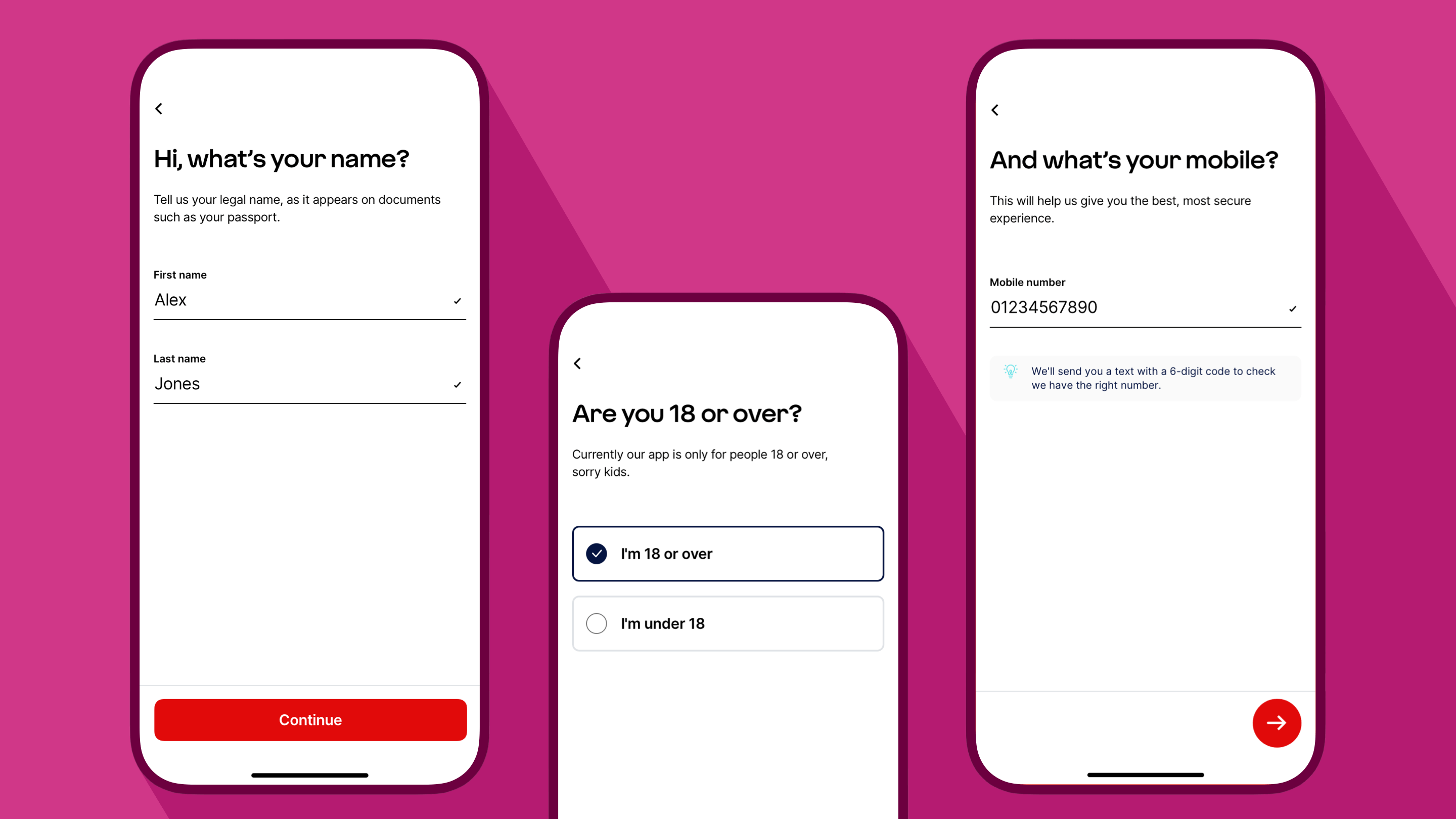
3. One thing per page
Let’s bust a myth. One thing per page is not actually about having a single question on each page (although, it could be).
This principle is about splitting up a complex process into smaller pieces and placing the smaller pieces on screens of their own. It might be that some pieces relate to each other and need to be kept together. It might be best to split things up to allow more room for an explanation. It might be better to put things on different screens so there is room for the keyboard to be displayed automatically on a mobile device.
It depends on context, who is using the form, and their needs at that moment. A customer completing an unfamiliar task will benefit from concentrating on one element at a time, however a mortgage broker following a familiar process can move at a faster pace.
The benefit of one thing per page is to reduce cognitive load. It might mean more taps overall but the form will feel easier. It also makes it simpler to identify issues using analytics, which helps us reduce friction.
4. Ask fewer questions (most of the time)
To make a form feel quick and super-slick, we ask as few questions as we can. Sometimes though, more can be more.
For example, in a mortgage decision-in-principle form, where a customer values the confidence that we will lend to them, it might be better to ask a few more questions. This increases the confidence that they will be accepted at full application.
Fewer questions in this scenario might make the form shorter but would result in a less accurate assessment.
We like to ask simple questions. Sounds obvious, right? Well, simple questions might mean two questions are better than one. A lower cognitive load will increase the cadence at which questions are answered, resulting in two questions often being faster to complete than one.
For unfamiliar questions or those which feel awkward, make use of hint text to explain why we are asking. This way, people feel confident in completing the question, and understand our need for the information.
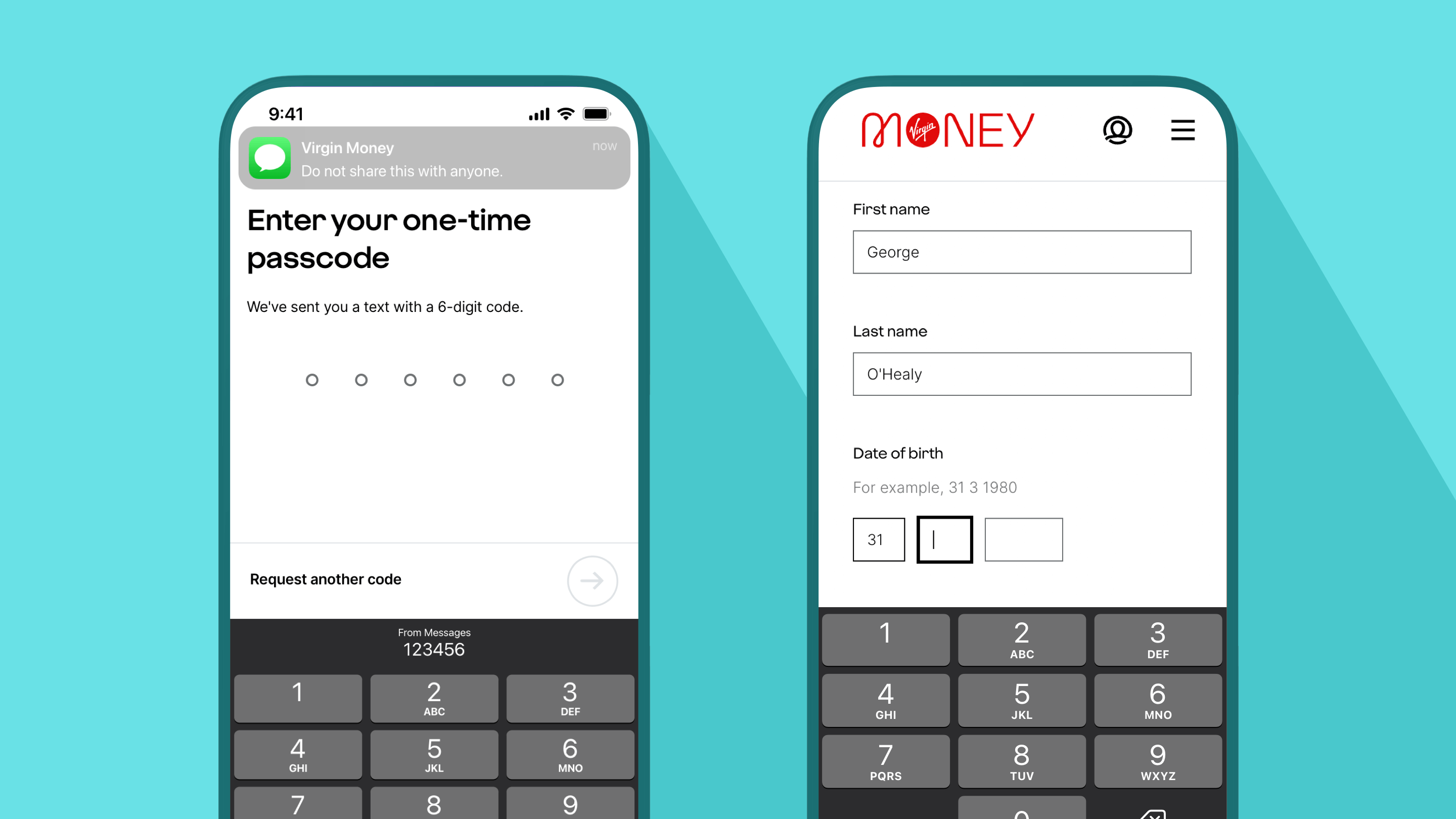
5. Accessible and friction-free
To make sure customers of any ability can use our forms we adhere to WCAG 2.1 guidelines, aiming for AA compliance. Fonts must be easy to read. The journey must work with a keyboard only, so people who can’t scroll can tab their way through instead. And screen readers must be able to navigate content and read out descriptions of visual elements such as videos, diagrams, graphs and charts.
Modern operating systems and browsers enable people to enter personal details with a tap. This prevents manual errors and speeds up the process. We can use auto-complete for details such as name, address, contact info and even payment details.
On mobile devices we select the appropriate keyboard for each field; a numeric or telephone keyboard when entering figures and an alphanumeric one when entering words. And we avoid auto-advancing someone from one screen to the next. This gives them time to review their selection and correct a mis-key before progressing.
Along with auto-capitalising names and allowing apostrophes or hyphens, we make completing a form effortless. Crafting accessible forms is better for everyone and it’s better for Search Engine Optimisation (SEO) too.
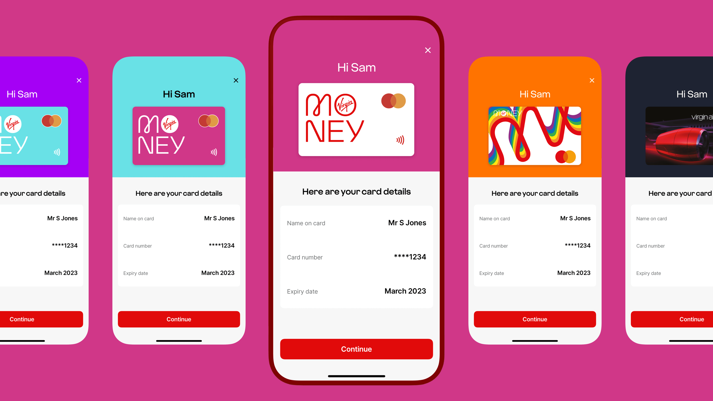
6. Feels like a conversation
To make a form feel Virgin we carefully use words to make it sound more natural and human. If the form felt robotic, completing it would feel like a dry data entry task.
Context is important so we strike the right balance between our playful Virgin tone of voice and when we need to deliver content in a ‘straight-up’ manner.
We personalise the experience where we can, to make the form more conversational. For example, in our Credit Card App onboarding journey, we display a customer’s first name and their card design as part of the digital conversation.
Every good conversation ends in a friendly way, so in a Virgin Money form you’ll not find any dead ends - unless we deliberately design them in. We always make sure a person knows what to do next or where to go for help.
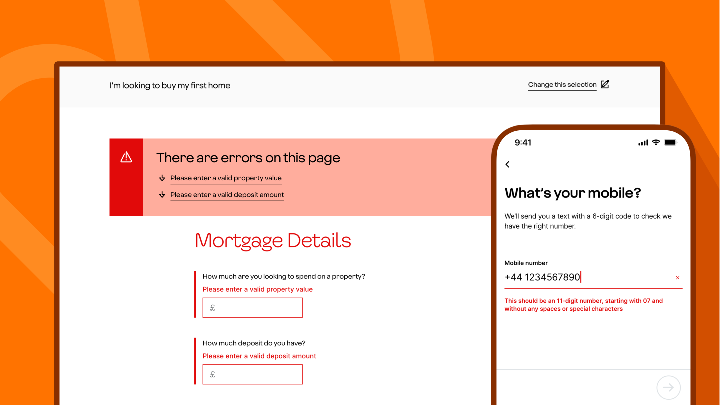
7. Error prevention and recovery
An important part of the experience is to prevent errors happening in the first place. Once we’ve created a prototype our User Research team usability test our forms with customers. This helps us iron out any friction and remove bias or incorrect assumptions. Often, simple tweaks to language or the inclusion of hint text can easily prevent unnecessary frustration and calls into our contact centre.
An important part of the experience is to help people recover from errors. In apps where there is one input on a view, we activate the call-to-action button when the customer has met the minimum requirements.
It’s different on web forms where we have multiple inputs on a screen. If a customer taps or clicks continue before all the field conditions are met, we display an error box at the top of the screen. This explains which inputs need attention, enabling the customer to navigate to the errors before continuing.
This is a good approach for accessibility too. And stops people getting an error before they’ve had the chance to complete what they were inputting. This is an all-too common issue when inline error validation hasn’t been well considered.
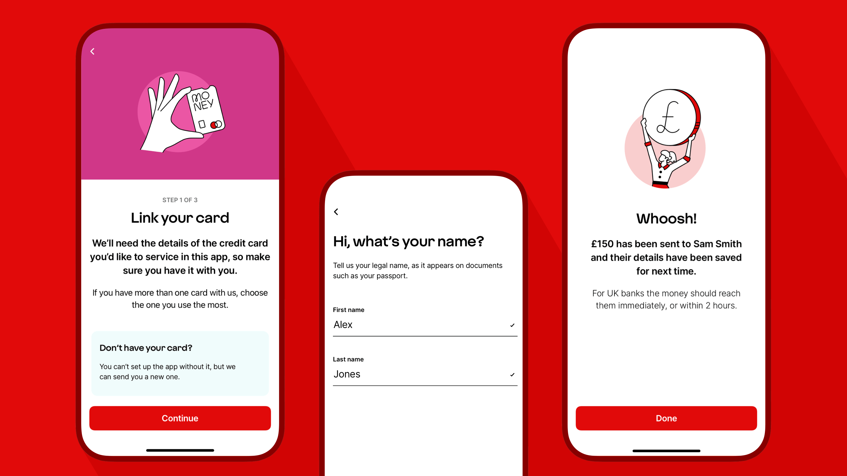
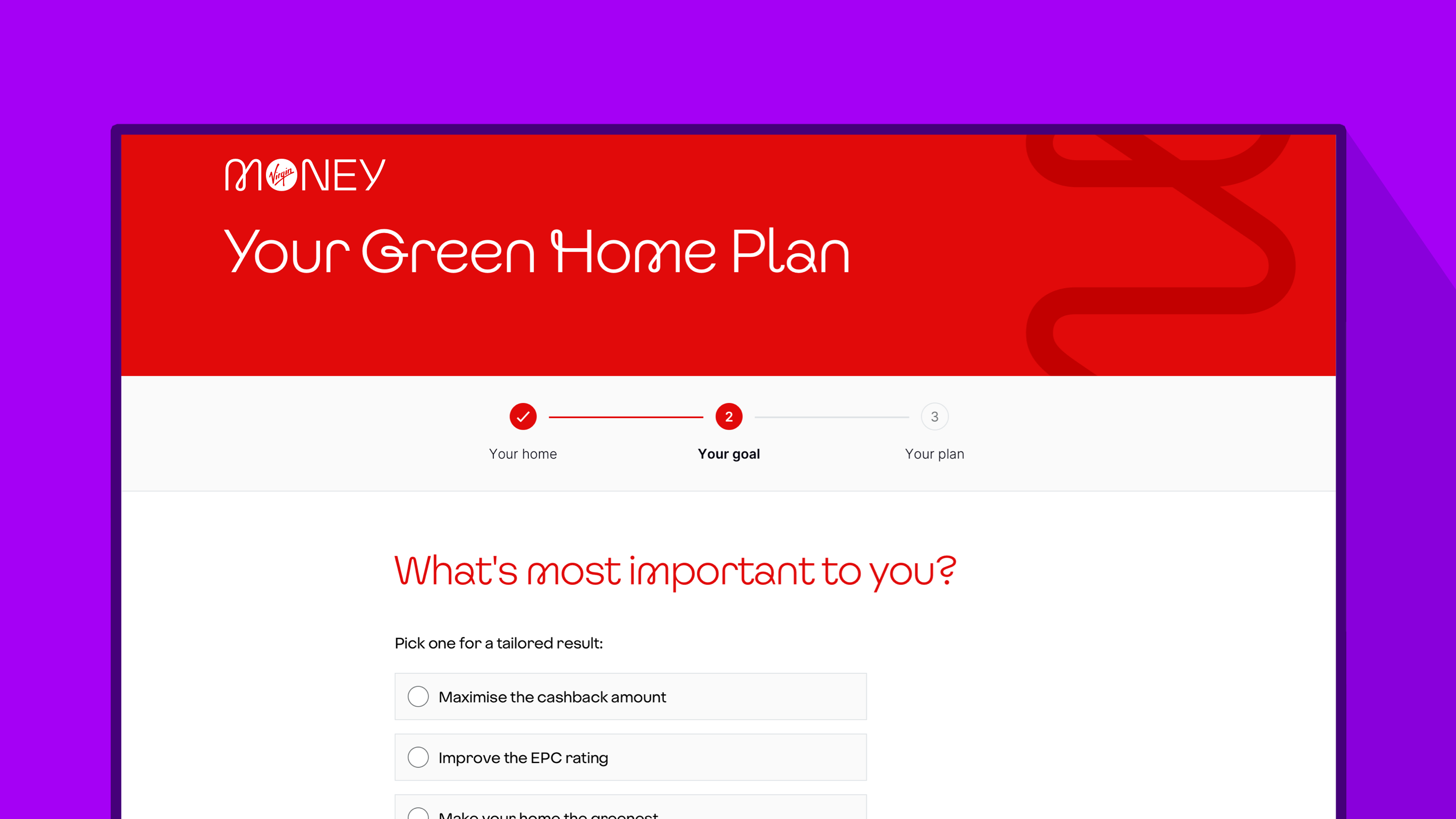
8. Indicate progress
It’s often cited that best practice is to show how far a person has progressed on their journey. However, there are different circumstances which dictate when a progress indicator is useful.
In our Credit Card App onboarding form that there is no indication of progress; that’s intentional. Usability testing proved that a progress indicator wasn’t necessary. The questions were familiar to the customer, so they kept a high cadence through to completion.
On longer, linear, more complex forms, steps can be useful to indicate progression.
However, on forms where people can either skip or incur additional steps, a progress indicator can feel misleading and unhelpful. Going from step 1 of 5 to step 2 of 8 is not a great user experience. We avoid using it in those situations.
The purpose of a progress indicator is to help a customer understand how long a form will take to complete. We also find that saying how long - on average - it takes to fill a form out up front is the best approach.
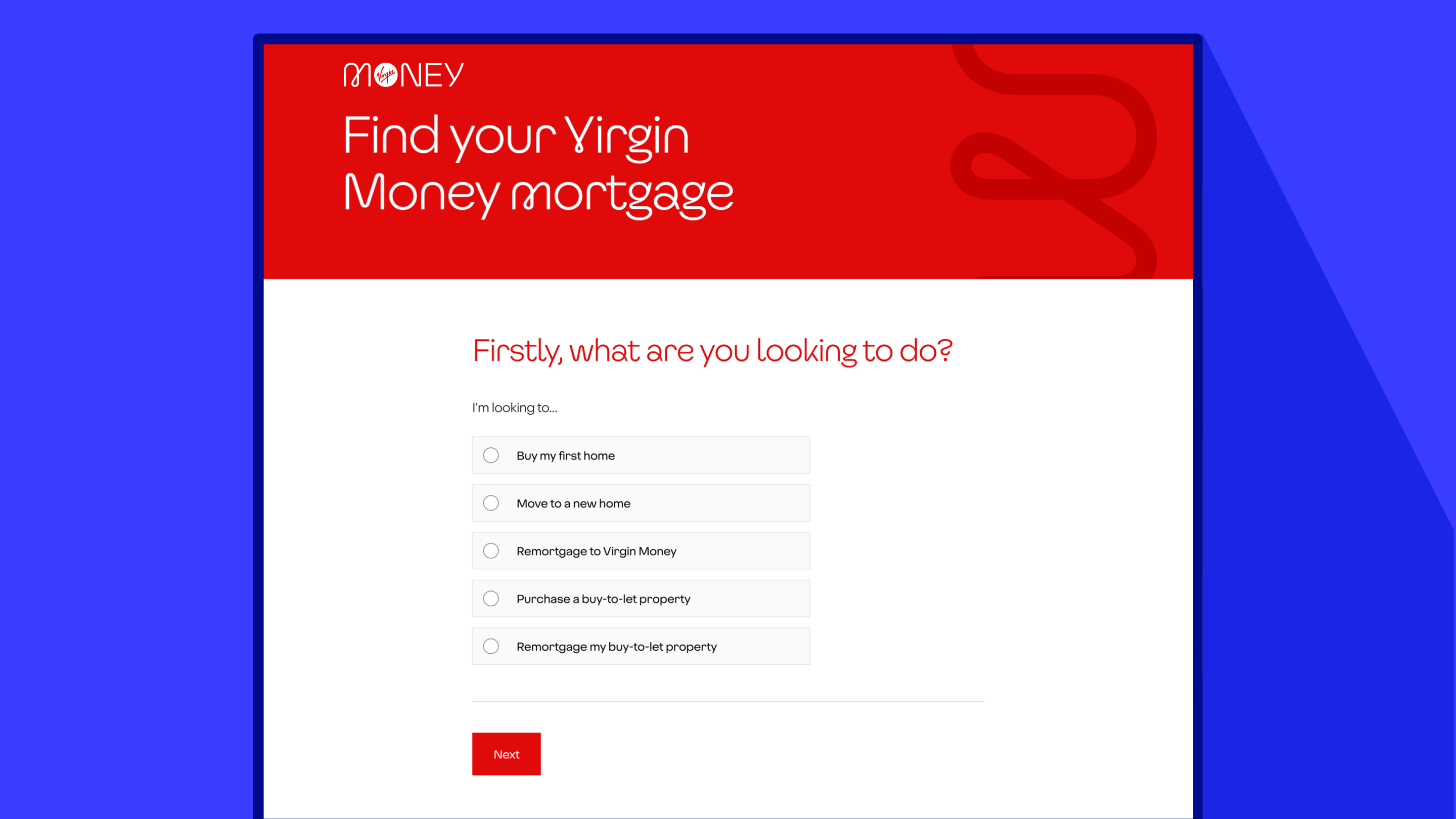
9. Dropdown the input of last resort (with exceptions)
This one is often a topic of debate for designers. We typically use dropdowns as the input of last resort.
This is because on mobile devices dropdowns take more effort. And, on some devices, the labels aren’t shown in full.
Instead, we prefer to list items using radio buttons - a tap-and-go approach. When there are six or more options, we may use a dropdown and work hard to keep the item labels short or ask questions in a different way.
There is always an exception to a rule and context is key. Take our site for mortgage brokers. Instead of following a mobile-first approach as we would for direct customers, we know brokers typically use desktop computers. Dropdowns work well on a desktop, so we use them on our dedicated mortgage broker site.
Recent mobile operating system developments have solved the issue of long labels not being able to be read in dropdowns. However, we continue to follow our tap-and-go approach using a set of radio buttons. We believe it’s a better experience on mobile devices, as it substantially reduces the amount of taps needed throughout the journey.
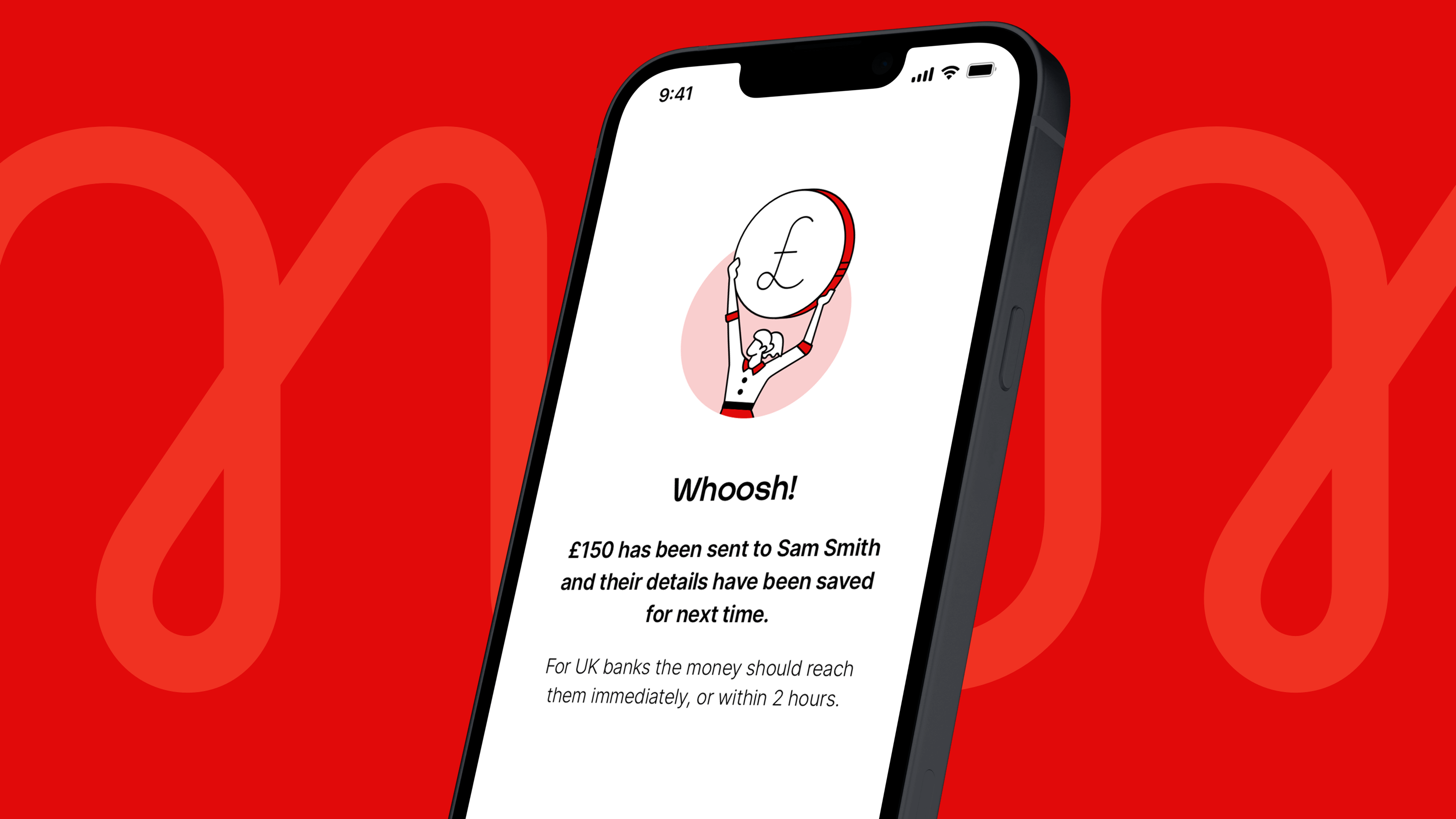
10. End on a high
The final screen is a moment of joy, where we emphasise our brand. We celebrate the completion of a journey and make the experience memorable with a touch of emotion. We now end our usability tests with a Smile Score question set to determine how people feel about their experience.
These are the core principles which enable us to design effective forms which feel distinctly Virgin.