Our latest inclusive design updates
Over the last 12 months, we’ve made a bunch of inclusive design improvements to our website and apps. Before I dive into the detail, I want to give a huge shout out to our talented team of content designers, digital designers and user researchers. Especially those working on our new flutter codebase. These improvements wouldn't have been possible without everyone's relentless dedication to push for better and make things more accessible for our customers.
As a team, we know there's always more to do, but here's a quick run down of what we've been working on recently.
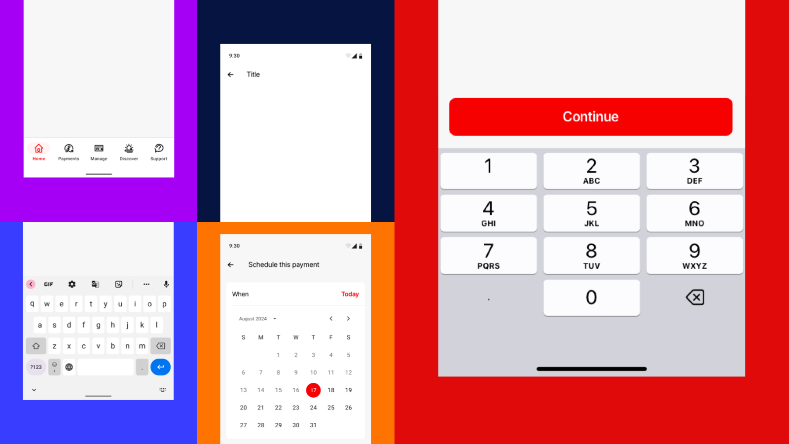
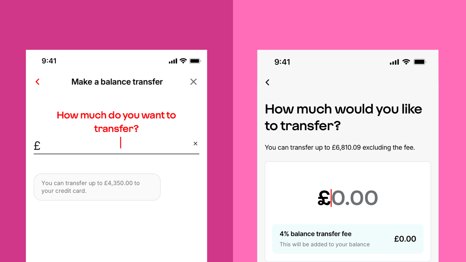
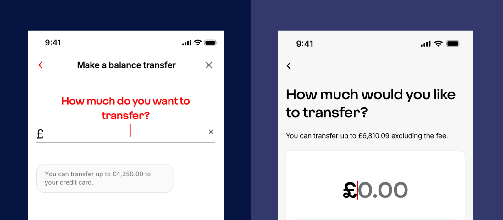
1. Full-width buttons
We’ve removed right-aligned circular arrow buttons from forms. Instead, we now use full-width buttons with clear labels.
Why this is more inclusive:
- Easier to use for both left and right-handed people.
- Clear labels improve understanding.
- Reduces reliance on screen reader hints.
- Creates consistency across all journeys.
- Better experience for people using tablets.
- Large tap zone is especially helpful for anyone with a motor impairment.
2. Always-active button
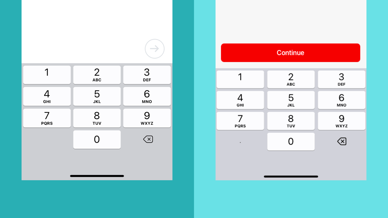
Unlike previous behaviour, form buttons are now always active, even before minimum validation is met.
Why this is more inclusive:
- People who haven't entered anything into the form will see error messages that give them feedback and put them in control. Reduces the need for additional screen reader guidance.
This matches how our web forms work, creating a more consistent experience across our online services.
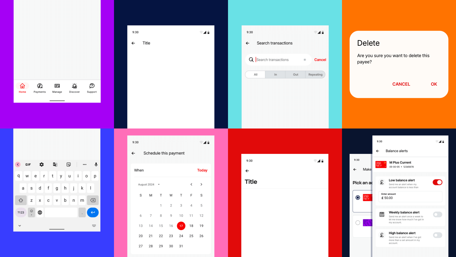
3. Displaying the keyboard on input screens
Previously, we prioritised speed by automatically showing the keyboard on screens with a single input field. This allowed for a quick “tap and go” experience. However, in some cases, the keyboard was covering important content.
We’ve now updated our approach. The keyboard will only appear when the customer taps on the input field. While this introduces an extra tap, it means that the whole page and all the content is visible. When someone taps on the field, the focus moves and the keyboard appears.
Why this is more inclusive:
- People can view all necessary information and input fields.
- People no longer need to work out how to dismiss the keyboard to see hidden content.
4. One destructive action at a time
We’ve simplified how users exit or go back in journeys. Only one destructive action is shown at a time, either back or close.
- On iOS: an ‘X’ appears at the start of a journey, followed by a back chevron on subsequent screens.
- On Android: a back arrow is shown throughout.
Why this is more inclusive:
- It’s consistent with platform standards from Apple and Android.
Exceptions:
- Long forms, for example mortgage applications, may show a ‘Save and exit’ button on certain screens.
- Sheets, a half page that pops up from the bottom of the screen, have a close icon in the top right to match operating system guidelines.
5. Moving our app hint text
Our app hint text used to sit below the input field. This meant everyone was reading the useful information after filling in the field. We moved our hint text to sit above the input field to align with our approach on web so information is now presented in a logical order.
Why this is more inclusive:
- Everyone, but especially screen reader users, gets all relevant info before we ask them to input.
6. Middle name(s) field
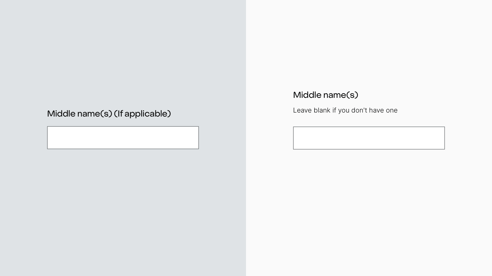
We’ve updated how we ask for middle names. The field now includes a label plus hint text and is never mandatory. It’s more words but more understandable.
Why this is more inclusive:
- Removes complex wording, making the question easier to understand.
- Respects that not everyone has one or more middle names.
7. End on a positive
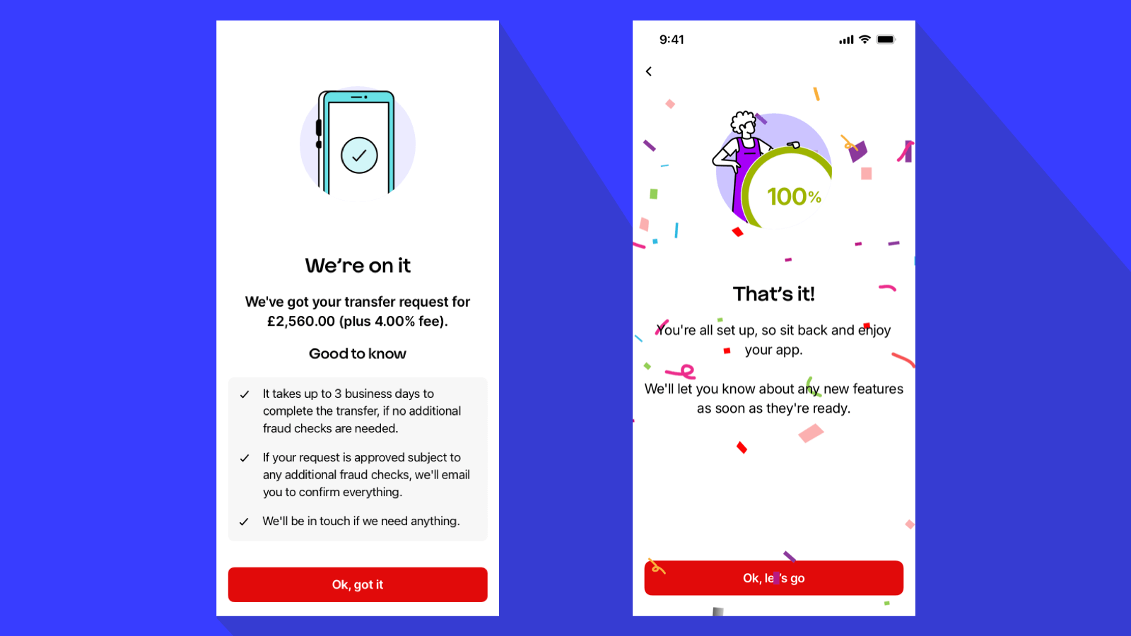
Our previous guidance to ‘end on a high’ didn’t suit every journey so we have clarified this principle. We tailor the tone to the context:
- For celebratory moments, like opening an account or winning a prize, we celebrate.
- For practical tasks like making a payment or raising a complaint, we simply confirm it’s done.
Why this is more inclusive:
- Recognises that context is important and impacts the tone at the end of a journey.
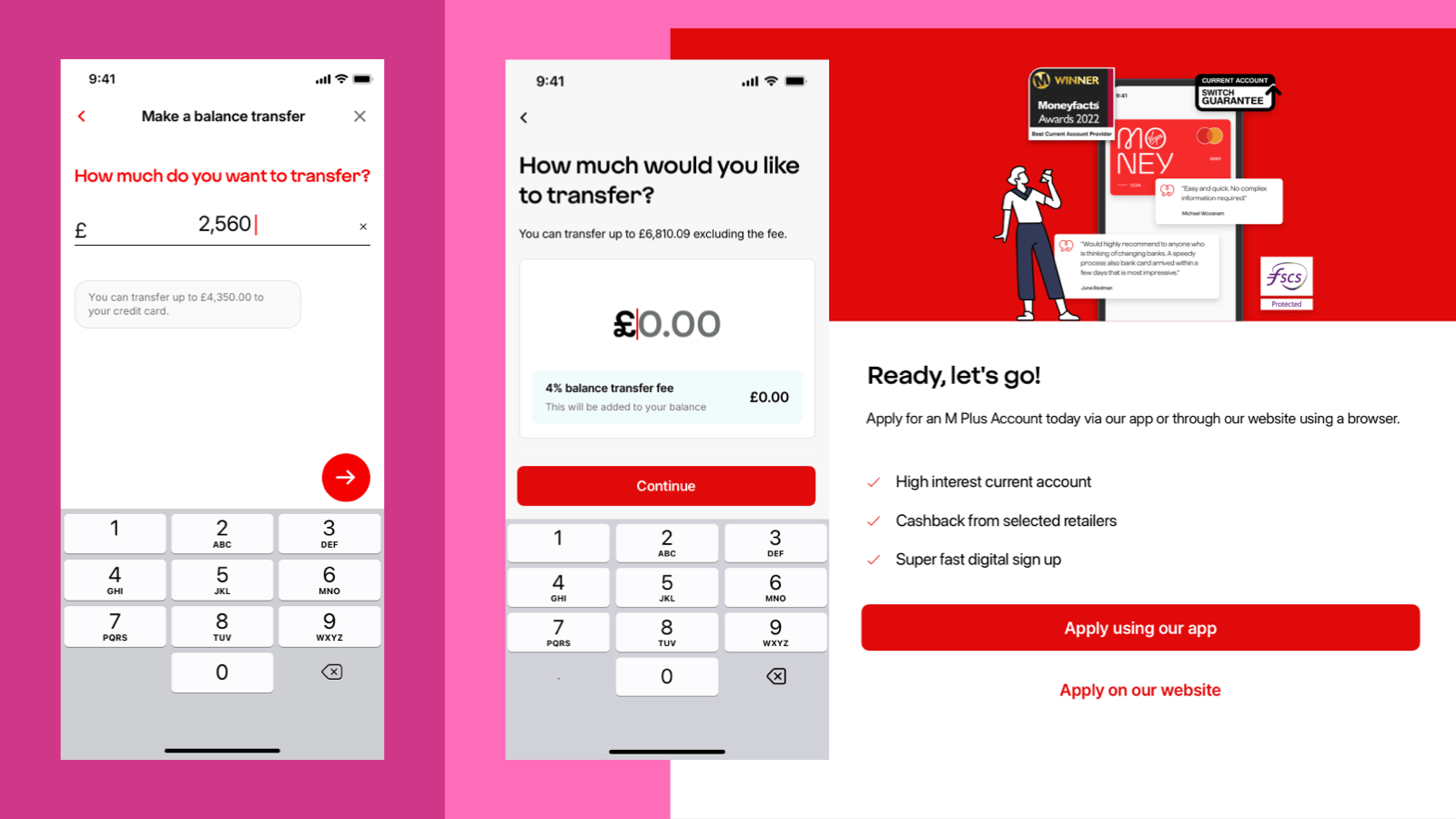
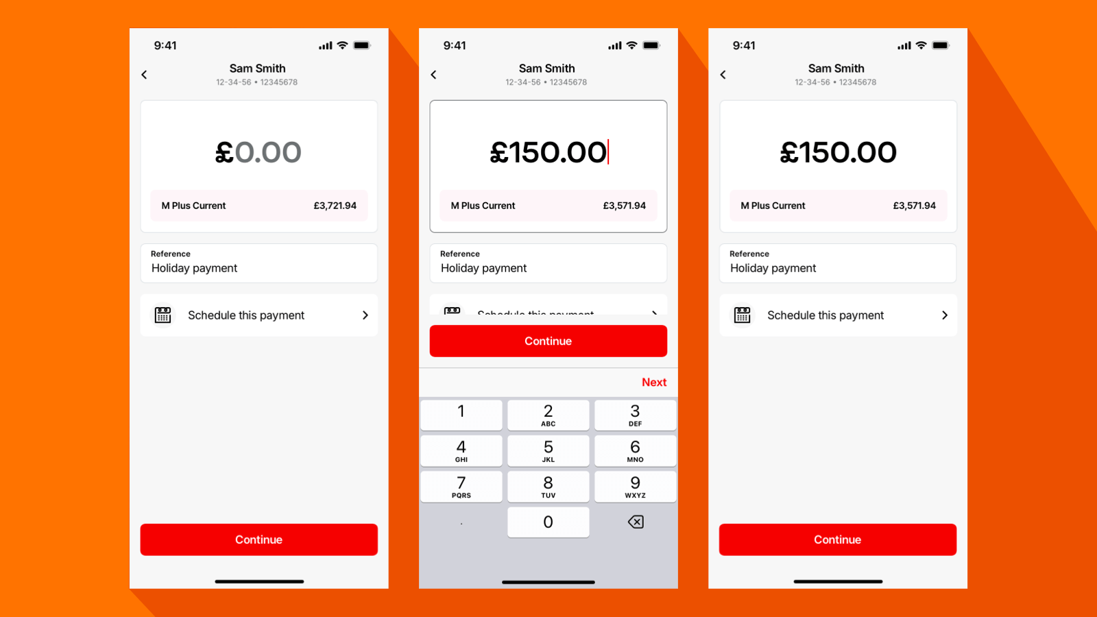
8. Payment inputs now start with pounds
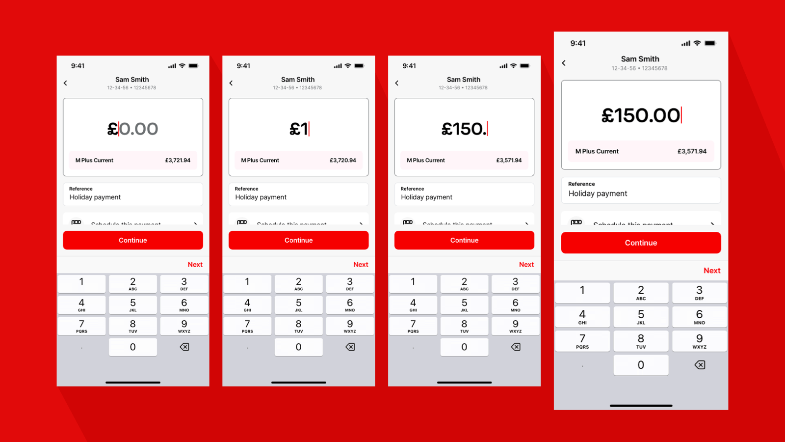
Previously, when someone is entering an amount, we would begin with pence. This was to help reduce the risk of accidentally entering a large payment. But recent user research has shown that's not the case. People find it easier and more intuitive to start with pounds.
Why this is more inclusive:
- We’re changing our guidance based on research of how most people enter an amount.
9. Designing for Android
We’ve taken care to design for the differences between Apple and Android operating systems. While our goal is consistency, we recognise each platform’s native behaviours and expectations. Here are the key areas we’ve refined to make sure it’s an inclusive experience across both:
9.1 Bottom navigation
The height and styling of bottom navigation adapt to the platform. On iOS, it’s slightly shorter, while Android follows its native, higher layout.
9.2 Back button
We use platform-native icons for back navigation:
- On Android, the back arrow is always left-aligned alongside the page title
- On iOS, the title is centre-aligned, and the back chevron is next to it
9.3 Search component
Our search field respects native styling:
- Android uses a more rounded border
- Additional spacing is applied around the icon and text for clarity
9.4 Modal views
Modals are presented natively on both platforms. Where possible, we make the call-to-action buttons Virgin Red. This makes it more consistent with our visual identity.
9.5 The keyboards
We use native keyboards, numeric or alphabetic, based on the input type. This ensures familiarity and ease of use for all users.
9.6 Bottom sheet behaviour
- On iOS, we typically stack views vertically, with some flexibility to reveal views from the side
- On Android, we follow a linear left-to-right flow, in line with OS guidance
9.7 Calendar interactions
We account for subtle differences in how calendar components behave across platforms, ensuring a smooth and intuitive experience.
9.8 Form controls
We’ve refined how form elements behave across platforms to ensure clarity and consistency.
- Radio buttons: We use a left-side circular selection indicator for both Apple and Android. Creating a unified experience regardless of device.
- Toggles: These follow native styling conventions. They adapt to each platform’s visual language to maintain familiarity and accessibility.
Why this is more inclusive:
- Ensures consistency across devices.
- Respects platform-specific expectations, reducing cognitive load.
Explore further
Explore how our inclusive design thinking has evolved over the past 18 months:
- Clear content: Writing for screen readers by Lily Brinn - July 2024
- Adopting dynamic font scaling in our apps by Nicky Lock - June 2024
- Forms follow function: The art of form design by Stuart Pill - October 2023
