User research, our Business Credit Card – and Mary Poppins
You might think a research question can be answered using a single method. But user researchers actually use a large toolkit of methods. Think Mary Poppins and her magic bag.
This was how I approached a project for a new webpage promoting our Business Credit Card. The problem we had to solve was where to put the new page in the site navigation.
There was already a section in the navigation called ‘Accepting card payments’ with information about card machines. Initially, we wanted to add a section to the navigation called ‘Credit cards’. But there wasn’t enough space! So, we had to test some different ideas.
We needed to find out if adding a ‘Credit cards’ section would confuse people looking for card machines. Or if there was a section label that might work for both card payments and credit cards.
So, out came Mary Poppins’ bag of tricks!
The tricks of the trade
To answer our questions, I used a mix of user research methods:
- Card sorting
- Usability testing
- Tree testing
These allowed us to test assumptions, explore how users thought and try out solutions. And all without needing to build a prototype.
Card sorting
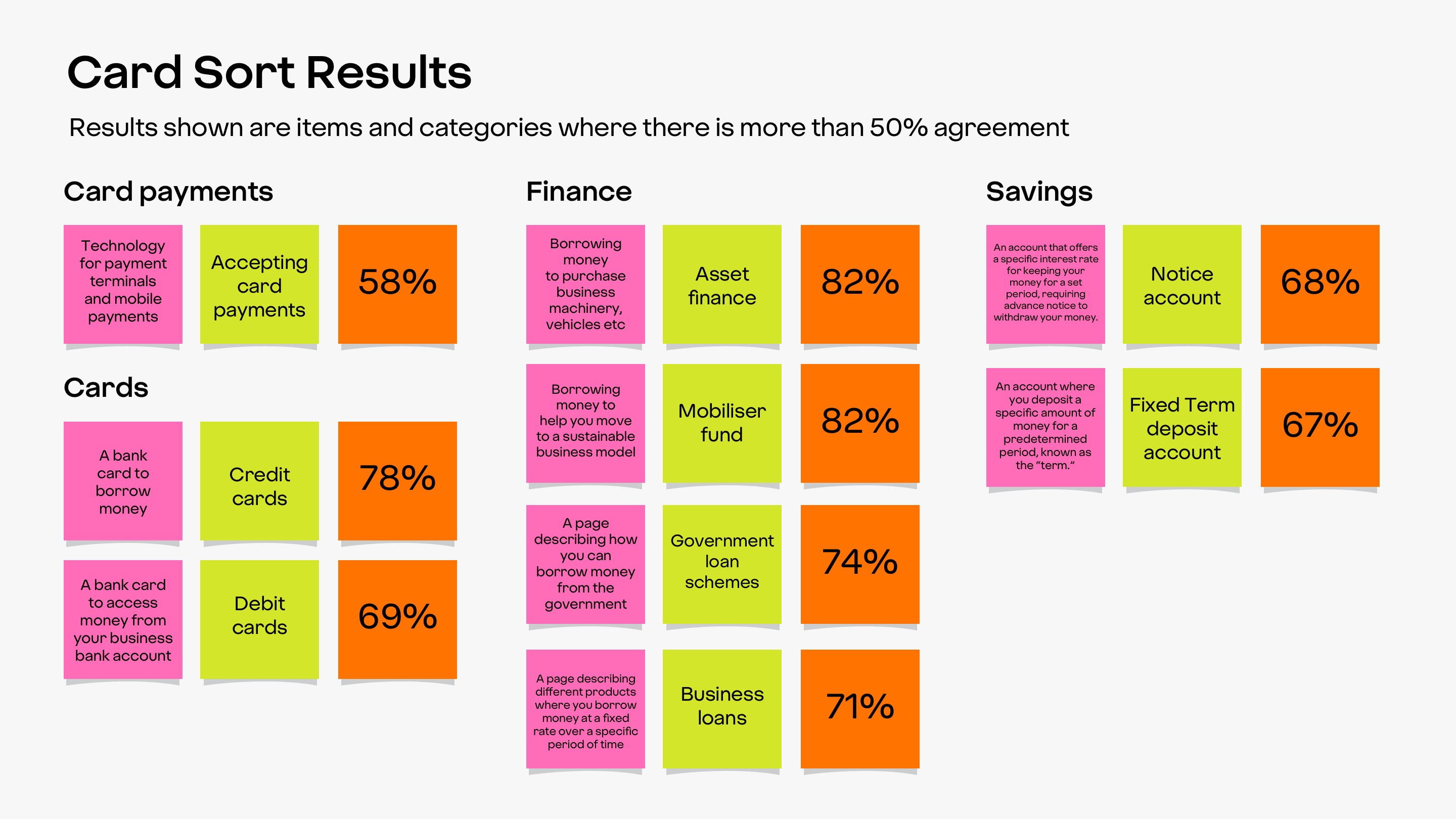
Card sorting is where people label cards based on how they understand and categorise information. I wanted to do a card sort to see if our ideas aligned with how customers thought.
First, I worked with a content designer from the business banking squad to define each item. Then I ran a moderated test where users labelled these definitions to ensure clarity. After cleaning up the definitions, I set up the card sorting.
The results showed strong alignment with our existing navigation sections, especially current accounts, cards and finance.
I also tested a new ‘Credit’ section. This found that 78% of people felt credit cards belonged in ‘Cards’. Finance also performed well with over 70% agreement. But ‘Card payments’ only just met the threshold of 50% agreement. This showed that people were unsure where “Accepting card payments” should sit, possibly due an overlap with ‘Cards’.
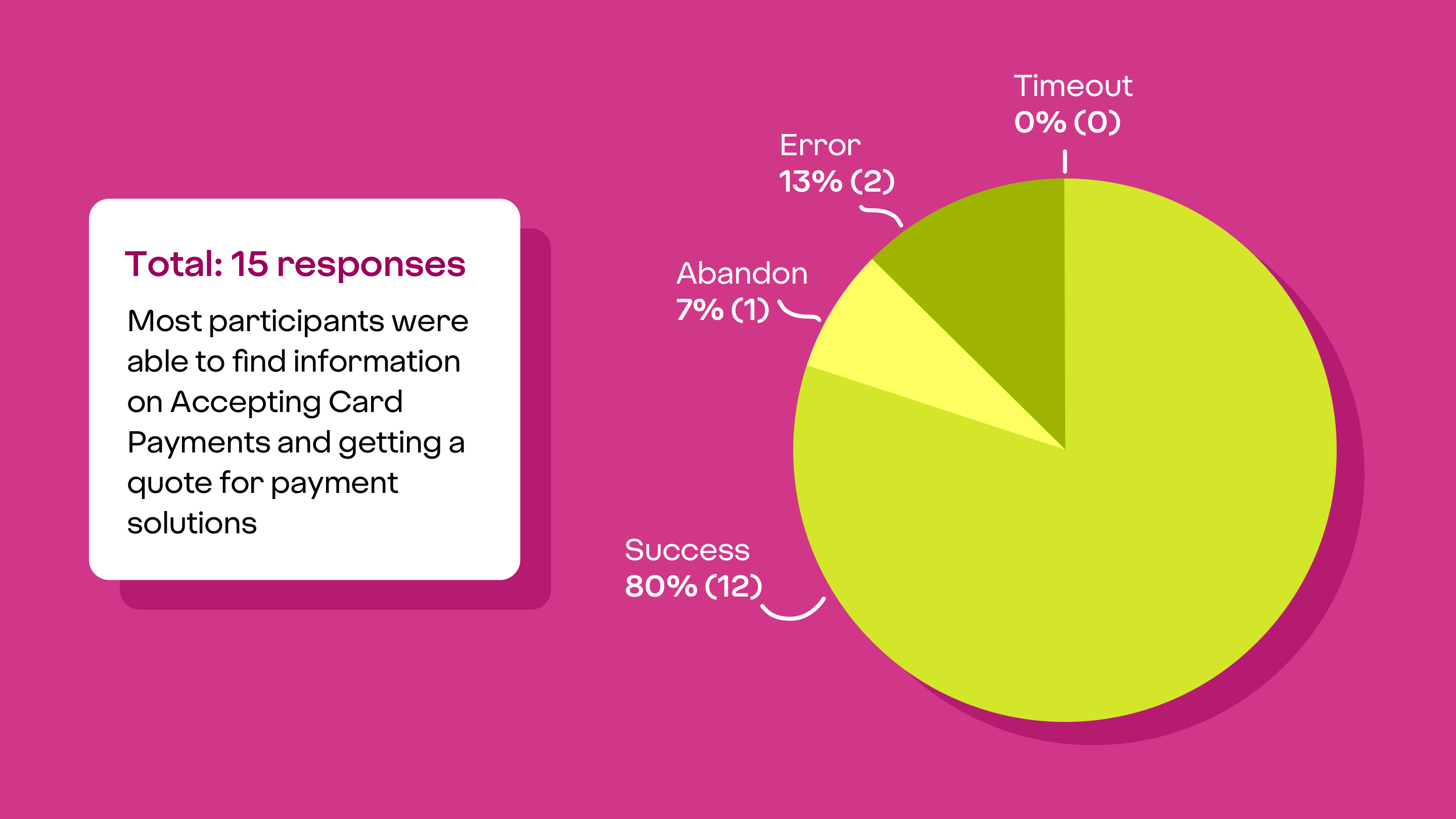
Usability testing
I ran a usability test to see how people looked for information about ‘Accepting card payments’. This used our existing webpage.
We found that the navigation was confusing. About 25% of people clicked on ‘Our products’ instead of ‘Business’ in the main navigation, even though I asked them to imagine they were business owners.
Some people also switched between ‘Cards’ and ‘Card payments’, trying to match the exact wording of the task. One person said they were: “feeling their way around the pages”.
We’d focused a lot on where to place card payments and card readers, but it became clear we needed to think more about where credit cards should be in the menu.
Tree testing
Using what we knew about card payments, we wanted to look at using different menu labels to see how people would search for credit cards. We didn’t have a prototype, so the next best option was a tree test.
I ran three tree tests, making small changes to the menu labels and asking people to look for different things in each test. Again the results were interesting.
- Changing ‘Our products’ to ‘Personal’ reduced confusion and helped people look for credit cards or card readers in the business part of the site.
- People didn’t associate credit cards with ‘Card payments’ and so struggled to find them in that section.
- People didn’t associate card readers with ‘Cards’ and wanted a more descriptive label.
- When asking people to look for card readers under ‘Cards’, most tried to find it in ‘Specialist business’ or ‘Finance’.

Outcomes
After all the different tests, I shared the findings with the team. We talked about our options, particularly given our tight deadlines.
We decided the best option was to put the new credit card page in a new navigation section called ‘Cards’. We then moved ‘Accepting card payments’ to this section too.
Both these products are revenue-making, but data showed less traffic to ‘Accepting card payments’ than other products. So we felt comfortable moving it out of the main navigation. And we needed to make sure we clearly promoted the new Business Credit Card page. In April, there was a 13.5% application completion rate from people clicking on that page.
Reflections
This project showed just how complex it is to design a navigation menu. Changing a single label can affect the whole site structure. But by using a mix of research methods, we were able to find deeper insights and ask better questions. Having the time to explore these questions was also key.
One unexpected benefit was how our findings supported other teams. For example, we shared our insights about how people struggled with the main navigation with another team working to improve it.
Ultimately, combining research approaches not only led to better outcomes, but also made the process more interesting and rewarding.
Supercalifragilisticexpialidocious!